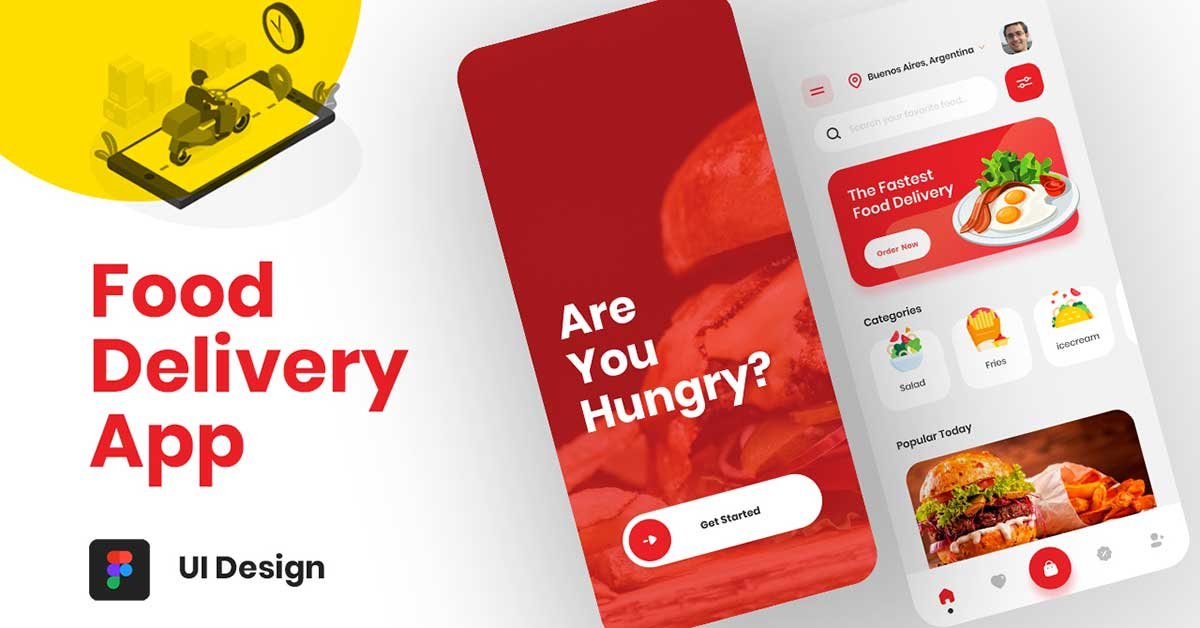
Creating a food app that is both functional and visually appealing requires more than just good food images—it requires a well-thought-out food app UI design that provides a seamless experience for users. Figma, one of the most popular UI/UX design tools, makes this process easier, offering collaborative features, responsive design options, and robust prototyping capabilities. Whether you’re building a food delivery app, a restaurant menu app, or an online food marketplace, Figma is a great platform to bring your vision to life.
In this guide, we’ll walk through designing a simple yet effective food app UI design that includes two key pages: the Get Started page and the Home page. We’ll cover everything from essential app features like location tracking and search filters to creating a smooth user experience with easy navigation options, such as a bottom bar with quick access to key functionalities.
To learn Figma, UI/UX design, web design, mobile app ui design, responsive design, no-code development, and AI-powered tools, and to download premium quality UI kits, Check out my YouTube channel (@uixDesignAcademy) for simple and easy beginner tutorials!
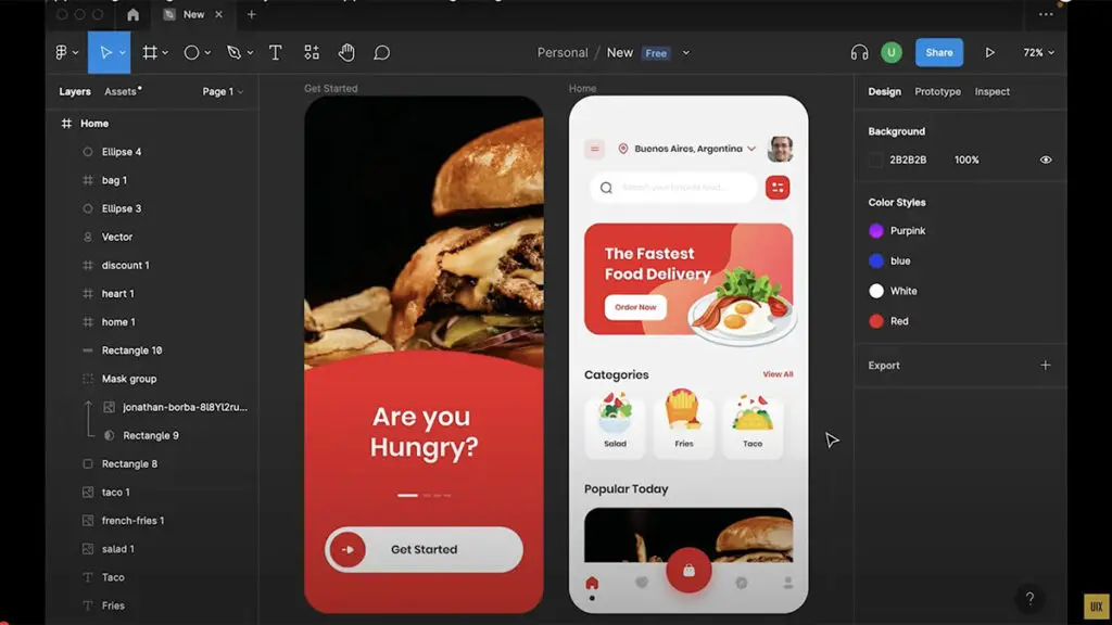
The Get Started Page: Welcoming Users
The Get Started page is the first thing users see when they launch your food app. It sets the tone for the entire user experience and should be designed to be clean, inviting, and informative. This page usually contains a brief introduction to the app and gives users the option to sign up, log in, or start using the app as a guest.
Key Design Elements:
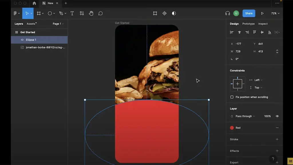
Simple Visuals: Use high-quality images of food to attract attention. Figma allows you to easily insert and adjust images to fit your design, ensuring the food looks appetizing.
Clear Call-to-Action (CTA): Include buttons like “Sign Up,” “Login,” or “Explore Now” to guide users to the next step.
Branding: Incorporate your brand’s colors, logo, and tagline for consistency and brand recognition.
Figma’s prototyping tools make it easy to create smooth transitions between the Get Started page and the Home
page, which is the heart of the app. Now that users have been welcomed, let’s dive into the Home Page and its essential features.
The Home Page: The Heart of the Food App
The Home Page of your food app is where most of the interaction happens. It’s important that this page is easy to navigate and packed with intuitive features that enhance the user experience. Here’s how to structure a user-friendly food app UI design in Figma for the Home page:
Key Design Features on the Home Page:
Location Tracking:
Food app UI design often requires location-based features to ensure users get relevant results for food delivery or restaurant discovery. On the Home page, a location input bar allows users to enter or detect their current location.
Figma’s components make it easy to design a location input with a dropdown for suggestions or a map integration.
Search Filter:
Implementing a search filter that allows users to filter food items by categories, cuisine, or price is crucial for a smooth browsing experience. Use a simple, intuitive design with icons and dropdown menus for categories like Vegetarian, Non-Vegetarian, Vegan, and others.
In Figma, you can design a search bar with integrated filters for easy access. Prototyping in Figma allows you to simulate how filters would work, offering a real-time preview of how users can narrow down food choices.
User Profile:
Users should have the option to quickly access their profile, where they can view past orders, payment details, and preferences. Design a profile icon that is accessible from the top-right corner of the screen.
Using Figma, you can design the profile page layout with user data and editable settings to personalize the experience. Figma also enables you to prototype interactions so users can easily navigate between their profile and the main app content.
Hamburger Menu:
The hamburger menu provides easy access to additional sections like settings, help, and about. Make sure it’s placed in an easily accessible spot on the Home page, like the top left corner.
Figma’s prototyping features let you create a fluid animation for the hamburger menu, giving users a modern, smooth experience as they navigate through different app sections.
Feature Image:
Feature images showcase highlights of the app, such as special offers, trending dishes, or new restaurant partners. These images should be visually striking and placed in a prominent location on the Home page.
Figma allows you to play around with grid layouts and image placement to make sure the featured content stands out and invites users to click.
Food Categories:
Organizing food into categories is a must-have feature for any food app UI design. Whether it’s Fast Food, Desserts, Healthy Meals, or Beverages, categories help users quickly find what they’re looking for.
In Figma, use cards or icons to visually represent different food categories. You can also prototype interactions, such as scrolling through category options or tapping on a category to view more options.
Popular Today Food:
Showcasing popular food options for the day can entice users to try trending dishes. Use a section like “Popular Today” that highlights top-selling items or dishes based on user preferences.
In Figma, create a dynamic carousel or grid layout for this section to keep it visually engaging. Add interactive hover states or animations to make the section more lively.
The Bottom Bar: Quick Access to Core Features
The bottom bar is an essential part of any food app, providing quick and easy access to the app’s key features. In your food app UI design, make sure the bottom bar is visible and accessible from all parts of the app.
Key Sections on the Bottom Bar:
- Home: Directs users back to the Home page.
- Favourite: Allows users to view their favorite food items or restaurants.
- Cart: Takes users to their shopping cart where they can review their orders.
- Discount: A section dedicated to offering discounts, special deals, or promotions.
- Profile: Quick access to the user’s profile.
Figma enables you to design a sleek, responsive bottom navigation bar, with each button having its own icon for easy identification. Using Figma’s prototyping tools, you can simulate the bar’s interactions to ensure it offers a smooth and intuitive experience.
Learn how to create a stunning Food App UI Design in Figma from scratch. Watch the complete tutorial and see the step-by-step process of designing a seamless and user-friendly food app. Click the Watch Tutorial button below to get started!
If you are interested to learn Food landing page design, click here