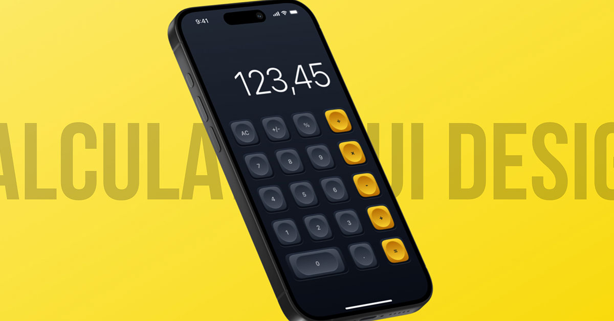
Welcome to Day 4 of the 100 Days Daily UI Design Challenge! Today, we’ll dive into creating a calculator design in Figma. Whether you’re new to UI/UX design or looking to sharpen your skills, this tutorial will guide you through the process of crafting a sleek and functional calculator app. By the end of this post, you’ll have a polished design in both dark and white themes, showcasing modern UI principles.
To learn Figma, UI/UX design, web design, mobile app ui design, responsive design, no-code development, and AI-powered tools, and to download premium quality UI kits, Check out my YouTube channel (@uixDesignAcademy) for simple and easy beginner tutorials!
What You’ll Learn
- How to design a calculator app UI in Figma.
- The importance of clean layouts for usability.
- Creating dark and white themes for better accessibility.
- Leveraging Figma components for efficient design workflows.
Why Calculator Design?
The calculator is one of the most fundamental and frequently used apps, making it a perfect exercise for practicing UI design principles. A great looking calculator design should be:
- User-friendly: Buttons and text should be clear and accessible.
- Visually appealing: Themes like dark and white can enhance usability for different lighting conditions.
- Functional: Focused on providing a smooth user experience.
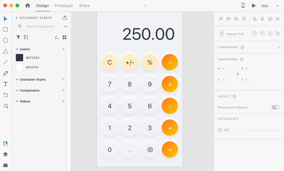
Step 1: Setting Up Your Figma Workspace
Before diving into the design, ensure your workspace is ready:
Create a New Frame:
Open Figma and create a mobile frame (e.g., iPhone 14 or any standard size).
Define Your Themes:
Decide on two color palettes: one for the dark theme and one for the white theme.
Dark Theme: Use darker shades (#1A1A1A for background) with vibrant accent colors.
White Theme: Use lighter shades (#FFFFFF for background) with subtle contrasts.
Grid Setup:
Apply a 4-column grid with a gutter to align elements properly.
Step 2: Sketching the Layout
Start by planning your calculator layout in FigJam or on paper. The calculator design typically consists of:
Input Display: A screen to show calculations.
Buttons: Numbers (0-9), operators (+, -, ×, ÷), and functional buttons (AC, =, etc.).
Here’s a basic layout:
Top Section: Calculation display.
Middle Section: Number buttons.
Bottom Section: Functional buttons (e.g., equals, clear).
Step 3: Creating the Calculator Design UI
Design the Display Area
- Use a Rectangle to create the display area.
- Add a text layer for the numbers.
- Use a bold font like Roboto or SF Pro Display for readability.
- Ensure the text color contrasts well with the background:
- Dark Theme: Use white (#FFFFFF) text.
- White Theme: Use black (#000000) text.
Design the Buttons
- Create a Button Component:
- Draw a circular or square shape for the button.
- Add a text layer for the label (e.g., numbers or symbols).
- Style the button:
- Dark Theme: Dark background (#333333) with light text.
- White Theme: Light background (#F5F5F5) with dark text.
- Use auto-layout to center-align text within the button.
Add Functional Buttons
- Highlight important buttons like AC or = with accent colors:
- For example, use orange (#FF9500) for the equals button in both themes.
- Adjust button sizes for emphasis:
- The equals button can span two columns for a bold appearance.
Grouping Components
- Use Figma’s Components and Variants:
- Create a main button component and add variants for different states (e.g., active, hover).
- This makes it easier to maintain consistency.
Step 4: Designing Themes
Dark Theme
- Background: #1A1A1A
- Button Background: #333333
- Text Color: #FFFFFF
- Accent Color: #FF9500 (for important buttons)
White Theme
- Background: #FFFFFF
- Button Background: #F5F5F5
- Text Color: #000000
- Accent Color: #FF9500 (for important buttons)
Step 5: Adding Microinteractions
Enhance usability with subtle interactions:
Hover States:
Slightly darken the button background on hover.
Press States:
Use a pressed-down effect with shadow adjustments.
Transitions:
Add smooth transitions for theme switching between dark and white.
Step 6: Preview and Test
- Use Figma’s Prototype Mode to simulate interactions.
- Test your calculator design on different devices to ensure consistency and usability.
- Get feedback from peers or share it on design communities for insights.
Why Use Dark and White Themes?
Offering both themes improves accessibility:
Dark Theme: Ideal for low-light conditions and reduces eye strain.
White Theme: Best for bright environments and high readability.
Summary:
Designing a calculator app UI in Figma is an excellent way to practice fundamental UI/UX principles. By focusing on simplicity, functionality, and aesthetics, Creating a calculator design that’s both practical and visually appealing. Incorporating dark and white themes ensures your app meets the needs of a wider audience.
Don’t forget to experiment with colors, layouts, and interactions to make your calculator design unique. Keep practicing, and stay tuned for Day 5 of the 100 Days Daily UI Design Challenge!