
A login screen UI design is a crucial component of any digital product, ensuring a smooth user experience. As part of my 100-day Figma challenge, I designed a modern login screen UI design in both light mode and dark mode. In this article, I’ll discuss my design process, best practices, and essential UI elements that make a login screen UI designboth functional and visually appealing.
To learn Figma, UI/UX design, web design, mobile app ui design, responsive design, no-code development, and AI-powered tools, and to download premium quality UI kits, Check out my YouTube channel (@uixDesignAcademy) for simple and easy beginner tutorials!
Importance of a Well-Designed Login Screen UI
A login screen UI design is the first interaction a user has with an application. A poorly designed login screen UI design can lead to user frustration, whereas an intuitive login screen increases engagement and usability. My goal was to create a sleek, modern, and user-friendly login screen UI design that is both functional and aesthetically pleasing.
Figma Design Process for Login Screen UI Design
For Day 1 of my challenge, I focused on designing a clean and interactive login screen with both light and dark mode options. Here’s how I structured my login screen UI design:
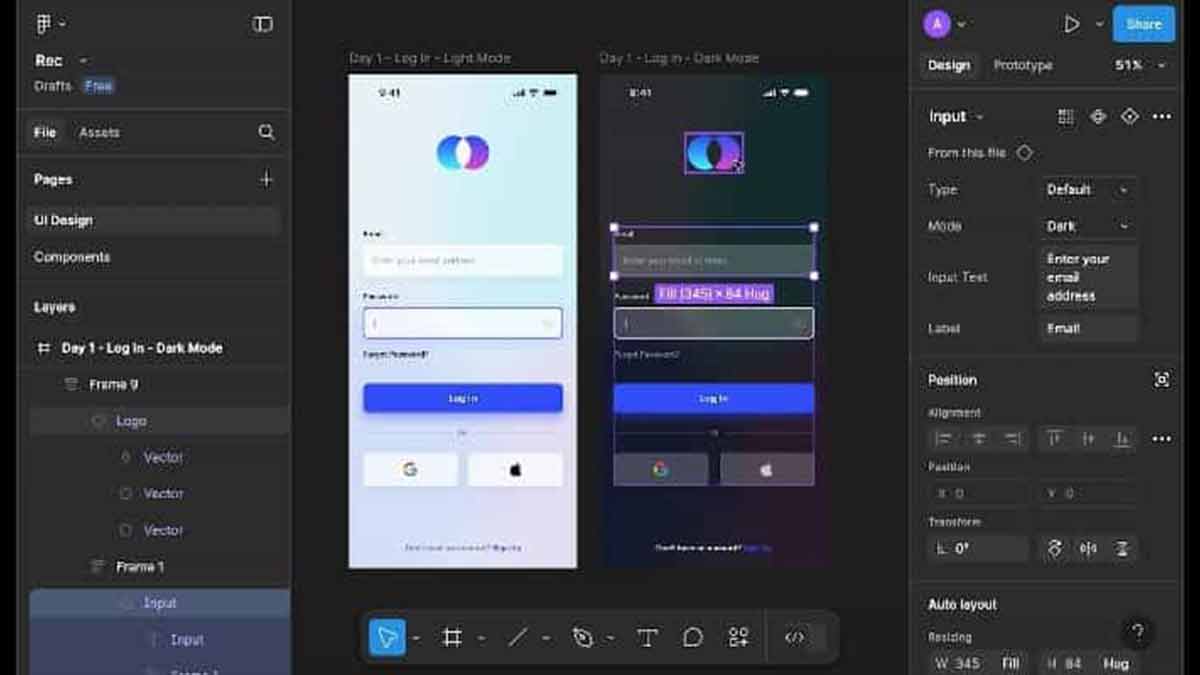
1. Wireframing the Login Screen UI Design
A well-structured login screen UI design starts with a clear layout. My Figma design includes:
- Logo/Brand Name at the top for identity
- Email and Password Input Fields for authentication
- Forgot Password Link to enhance usability
- Login Button with a high-contrast CTA
- Social Media Sign-in Options (Google, Facebook) for easy access
- Sign-up Link for new users
2. Choosing Colors & Typography for Login Screen
For the light mode login screen, I used a white background with light gray input fields to create a clean look. For the dark mode login screen, I opted for a dark background with high-contrast text and input fields, ensuring readability and accessibility.
Typography plays a crucial role in a login screen UI design, so I selected a modern sans-serif font for clarity and readability. The text color in light mode is dark gray, while in dark mode, it is white to maintain contrast.
3. Enhancing UI Design with Interactive Elements
A well-structured login screen requires:
- Rounded Input Fields for a sleek look
- Visible & Responsive Buttons for better interactivity
- Hover & Focus Effects to guide users
4. Dark Mode Optimization in Login Screen
With the increasing use of dark mode UI, I ensured my login screen transitions seamlessly between light mode and dark mode. The dark mode login screen maintains high contrast, readability, and user comfort.
Best Practices for an Effective Login Screen
- Keep the Login Screen Minimal – Avoid clutter for better usability.
- Use Clear Labels & Feedback – Users should understand form validation easily.
- Ensure Mobile Responsiveness – A login screen should work across devices.
- Add Social Login Options – Increases convenience for users.
- Optimize for Dark Mode – The login screen should provide a consistent experience.
Summary
This login screen UI design for Day 1 of my 100-day Figma challenge showcases a modern, user-friendly approach. A well-structured login screen plays a key role in user engagement and retention. Stay tuned as I continue designing new UI/UX elements in this challenge!