The signup process design day 2 is one of the most critical parts of a user’s journey in an app or website. A seamless, intuitive, and visually appealing signup flow can improve user retention, build trust, and enhance overall user experience. On Day 2 of the 100 Days UI Design Challenge, we focus on designing a modern, user-friendly signup process that provides a smooth onboarding experience.
To learn Figma, UI/UX design, web design, mobile app ui design, responsive design, no-code development, and AI-powered tools, and to download premium quality UI kits, Check out my YouTube channel (@uixDesignAcademy) for simple and easy beginner tutorials!
Why Signup Process Design Day 2 Matters
The signup process is the gateway to any platform. If it is too complex, lengthy, or confusing, users might abandon it before even signing up. A well-designed signup process should:
Be quick and simple – Avoid unnecessary steps and keep inputs minimal.
Have a clean UI – An intuitive layout encourages users to complete the process.
Be user-friendly – Clear call-to-action buttons and error-free interactions enhance usability.
Provide a sense of security – Users should feel confident entering their personal information.
By following best practices in UI/UX design, we can create an efficient and engaging signup experience.
Signup Process Flow
We will create a three-step signup process design day 2 consisting of:
- Get Started Screen – Introduction with branding and a call-to-action.
- Step 1: Create Your Account – Basic user details input form.
- Step 2: Upload Profile & Additional Details – Profile picture upload and additional information.
- Step 3: Confirmation – Success message with confetti animation.
Let’s go through each step in detail.
Step 1: Get Started Screen
The Get Started screen serves as a welcoming introduction, setting the tone for the signup process. It should create a positive first impression while encouraging users to move forward.
UI Elements:
- Logo and branding – Reinforce brand identity.
- Title: Join Us & Explore – A simple, engaging message.
- Tagline: Create an account and start your journey with us!
- Primary button: Get Started – Directs users to the signup form.
Design Considerations:
- Minimal and clean layout – Avoid clutter, keeping the focus on the call-to-action.
- Clear typography – Use bold, readable fonts.
- Engaging visuals – Consider adding subtle animations or an illustration to make the screen visually appealing.
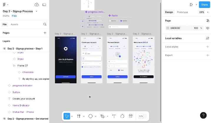
Step 2: Create Your Account
The main signup form should be simple, fast, and easy to fill out. Users expect a hassle-free experience with minimal fields.
UI Elements:
- Header: Create Your Account – Sets clear expectations.
- Input Fields:
- Full Name
- Email Address
- Password (with toggle visibility option)
- Primary button: Continue – Advances to the next step.
Best Practices:
- Use placeholder text – Provide examples for each field (e.g., “John Doe” for name).
- Inline validation – Show real-time feedback for errors (e.g., “Invalid email format”).
- Security tips for passwords – Include criteria such as minimum characters and special symbols.
By keeping the form short and optimized, users are less likely to feel overwhelmed or abandon the process.
Step 3: Upload Profile & Additional Details
Purpose:
This step enhances user profiles by collecting additional details, making the experience more personalized.
UI Elements:
- Header: Complete Your Profile – Encourages users to fill in details.
- Profile Picture Upload – Allows users to add a profile image.
- Additional Fields:
- Date of Birth (Date picker input)
- Phone Number (Country code dropdown + input field)
- Gender Selection (Radio buttons: Male / Female / Other)
- Primary button: Continue – Advances to the final step.
Best Practices:
- Provide default placeholders – Use icons or example text to guide users.
- Allow skipping optional fields – Users should be able to complete signup without feeling forced to enter non-essential details.
- Ensure responsive design – The layout should be optimized for mobile and desktop users.
Adding profile details at this stage helps personalize the experience while keeping the main signup form simple.
Step 4: Confirmation & Success Message
The final step reassures users that their account has been successfully created. A celebratory message makes the experience memorable and satisfying.
UI Elements:
- Header: 🎉 Account Successfully Created!
- Subtext: Welcome aboard! Your account is now ready.
- Confetti Animation – Enhances the celebratory effect.
- Primary button: Go to Dashboard – Takes the user to their profile or homepage.
Best Practices:
- Use animations wisely – Subtle confetti or checkmark animations can make the experience delightful.
- Keep the success message clear – Avoid unnecessary text.
- Guide users to the next step – Ensure the “Go to Dashboard” button is prominent.
A smooth and engaging signup completion screen can leave a positive impression, making users more likely to continue exploring the app or platform.
Signup Process Design Day 2
A well-designed signup process is more than just a form—it’s the user’s first interaction with your platform. By focusing on clarity, efficiency, and engagement, you can create a seamless onboarding experience that encourages users to sign up and explore further.
Try creating your signup process design day2 in Figma or Adobe XD, share your progress, and continue improving your UI skills. Want to start from Day1 .
Stay tuned for Day 3 of the 100 Days UI Design Challenge! 🚀🎨