Figma is one of the most powerful tools for UI/UX designers, making mobile app UI design easier and more efficient. In this Figma UI Design Tutorial, we will walk you through the process of designing a splash screen and onboarding screen, essential elements of any mobile app. Whether you are new to UI/UX design in Figma or looking to refine your skills, this guide will help you create a modern and engaging design.
Why Figma UI Design Tutorial for Mobile App Matters
Mobile app UI design is crucial because it defines the first impression users have of an app. A well-designed Figma onboarding screen helps users quickly understand the app’s purpose, while a visually appealing Figma splash screen design ensures smooth brand recognition. By using Figma UI design, you can create sleek, professional, and user-friendly screens that enhance the overall user experience.
Designing the Splash Screen in Figma
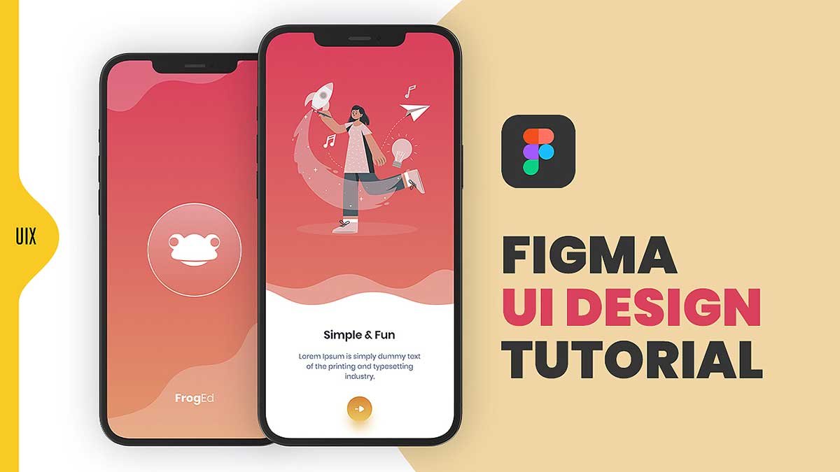
The splash screen in figma UI design tutorial is the first thing users see when they launch an app. It typically contains a logo, app name, and background design. Here’s what our Figma splash screen design includes:
- Background: A gradient transition from dark red to light orange for a warm and inviting look.
- Logo: A circular icon with a white outline containing a minimalist frog face in the center.
- App Name: “FrogEd” is placed at the bottom in a clean, white font.
- Wave Pattern: A stylish wavy design separates the top and bottom sections, adding visual interest.
To design this in Figma UI design, follow these steps:
- Create a frame with a resolution of 1080x1920px.
- Apply a gradient background using the Fill option.
- Import or design a logo and position it centrally.
- Add a text layer for the app name and apply a subtle drop shadow.
- Use the Pen tool to create a wave pattern and adjust opacity for a modern look.
Creating an Onboarding Screen in Figma
An onboarding screen in figma UI design tutorial introduces users to the app and highlights its key features. Here are the details of our Figma onboarding screen:
- Background: Uses the same gradient as the splash screen for consistency.
- Illustration: A woman interacting with a rocket, paper plane, light bulb, and musical notes to signify creativity.
- Heading: “Simple & Fun” in bold black font for clear messaging.
- Description: A short, readable text explaining the app’s purpose.
- Call-to-Action Button: A circular button with a yellow-orange background and a white arrow directing users to proceed.
Steps to Design the Onboarding Screen in Figma:
- Duplicate the splash screen frame for consistency.
- Add an illustration to make the screen engaging.
- Insert a heading and description with readable fonts.
- Design a CTA button with a shadow effect for depth.
- Arrange elements in a structured layout using auto-layout for responsiveness.
By following this Figma UI Design Tutorial, you can create a modern mobile app UI design that enhances user experience. Whether you’re working on a Figma onboarding screen or a Figma splash screen design, always focus on usability, aesthetics, and branding. Start designing today and make your app stand out!
To learn more about Figma UI/UX design Check out my YouTube channel (@uixDesignAcademy) for simple and easy beginner tutorials! and If you want to learn more, follow our 100 days daily ui challenge.