In this Bento Grid Figma tutorial, you will learn how to create a responsive Bento Grid design. This modern layout style is widely used for website design, portfolios, social media posts, and UI/UX projects. Whether you are working with WordPress, HTML & CSS, or Webflow, this guide will help you design a stunning Bento Grid layout that adapts seamlessly to different screen sizes.
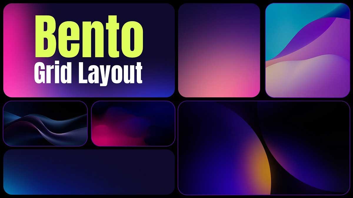
What is a Bento Grid?
The Bento – Grid is a design style inspired by Japanese bento boxes, where content is arranged in a visually appealing and structured manner. It allows designers to create dynamic layouts by mixing different-sized blocks, providing a clean and modern look for portfolios, websites, and social media posts.
Why Use a Bento Grid in 2025?
Bento – Grid layouts have become a top design trend in 2025 due to their:
- Responsive nature – Works well on all screen sizes.
- Aesthetic appeal – Clean, modern, and easy to navigate.
- Versatility – Ideal for websites, Instagram-style posts, and portfolios.
- User engagement – Enhances visual storytelling and UI/UX experience.
Creating a Bento – Grid Layout in Figma
Follow these steps to design a Bento Grid layout in Figma:
Step 1: Set Up Your Figma File
- Open Figma and create a new frame (e.g., 1440px width for a desktop layout).
- Use the Grid Layout feature to define columns and spacing.
- Set the grid structure based on your design requirements.
Step 2: Create Bento – Grid Blocks
- Use the Rectangle Tool (R) to create different-sized blocks.
- Adjust the spacing and alignment to maintain balance.
- Apply Auto Layout for better responsiveness.
Step 3: Apply Colors, Images, and Typography
- Choose a color scheme that complements your brand.
- Add high-quality images to enhance visual appeal.
- Use modern typography with consistent font styles and sizes.
Step 4: Make the Bento – Grid Responsive
- Use Auto Layout to adjust spacing dynamically.
- Set constraints to ensure blocks resize correctly on different devices.
- Test the layout in Prototype mode to check responsiveness.
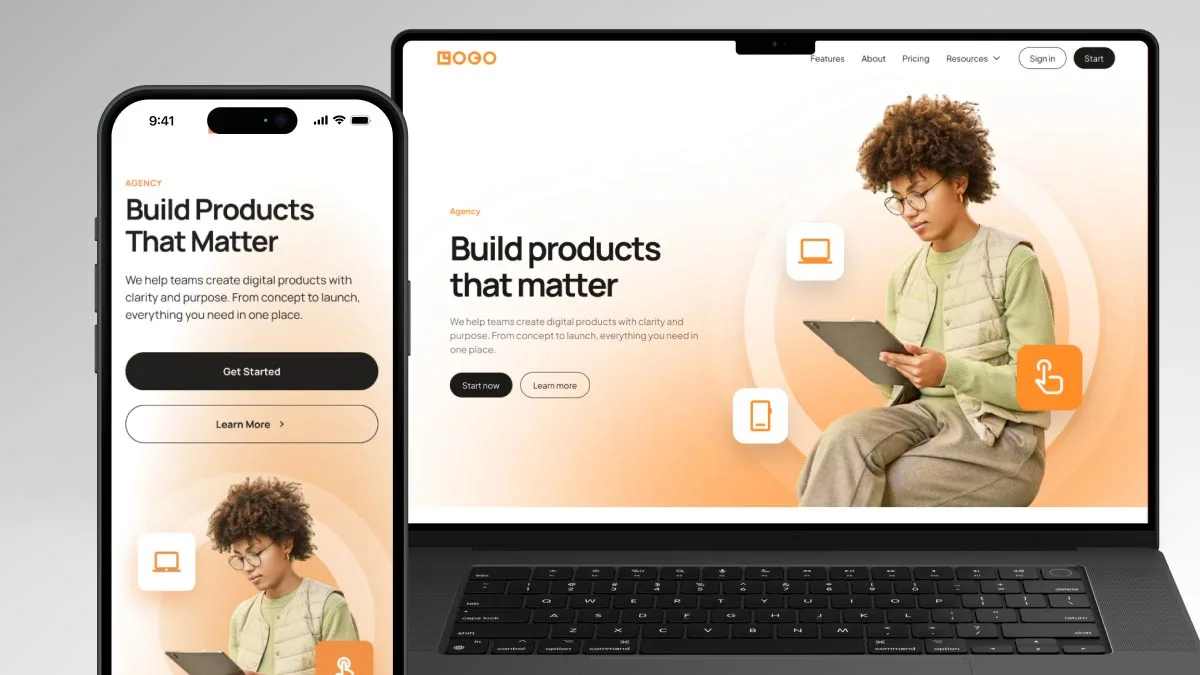
Bento Grid for Websites and Social Media
WordPress & Webflow
- Convert your Figma design into a custom WordPress layout or Webflow grid system.
- Use CSS Grid or Flexbox to recreate the Bento Grid structure.
HTML & CSS
- Implement the Bento Grid using CSS Grid properties.
- Define grid-template-columns and grid-template-areas for a structured layout.
Instagram & Social Media
- Use the Bento Grid to create stylish Instagram posts.
- Apply a modular approach for a visually consistent feed.
Bento Grid Generator: Automate Your Design
If you want to quickly generate a Bento – Grid layout, consider using a Bento – Grid Generator. This tool helps you:
- Create grid-based social media posts.
- Develop unique UI/UX designs effortlessly.
- Apply the latest responsive design trends of 2025.
The Bento – Grid is a powerful design trend that enhances the visual structure and responsiveness of web and UI/UX projects. By following this tutorial, you can create a professional Bento Grid layout in Figma and use it across different platforms, including WordPress, HTML & CSS, Webflow, and Instagram.
Start designing your Bento – Grid layout today and stay ahead of the 2025 design trends!
To learn Figma, UI/UX design, web design, mobile app ui design, responsive design, no-code development, and AI-powered tools, and to download premium quality UI kits, Check out my YouTube channel (@uixDesignAcademy) for simple and easy beginner tutorials, also check our daily ui challenge.