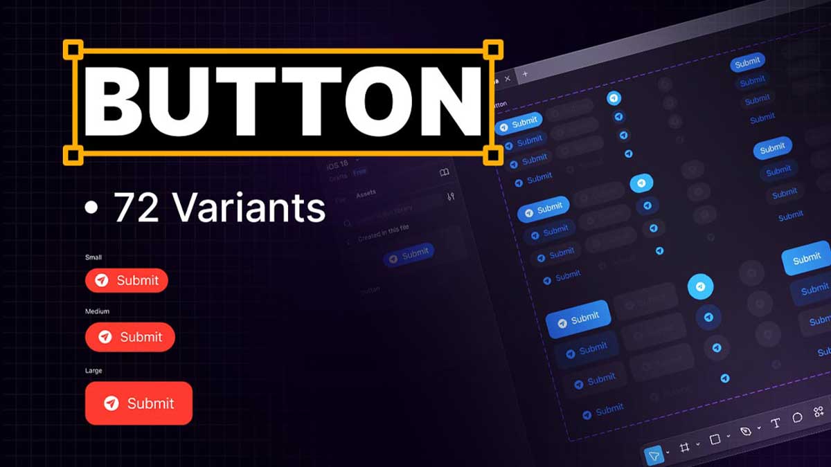
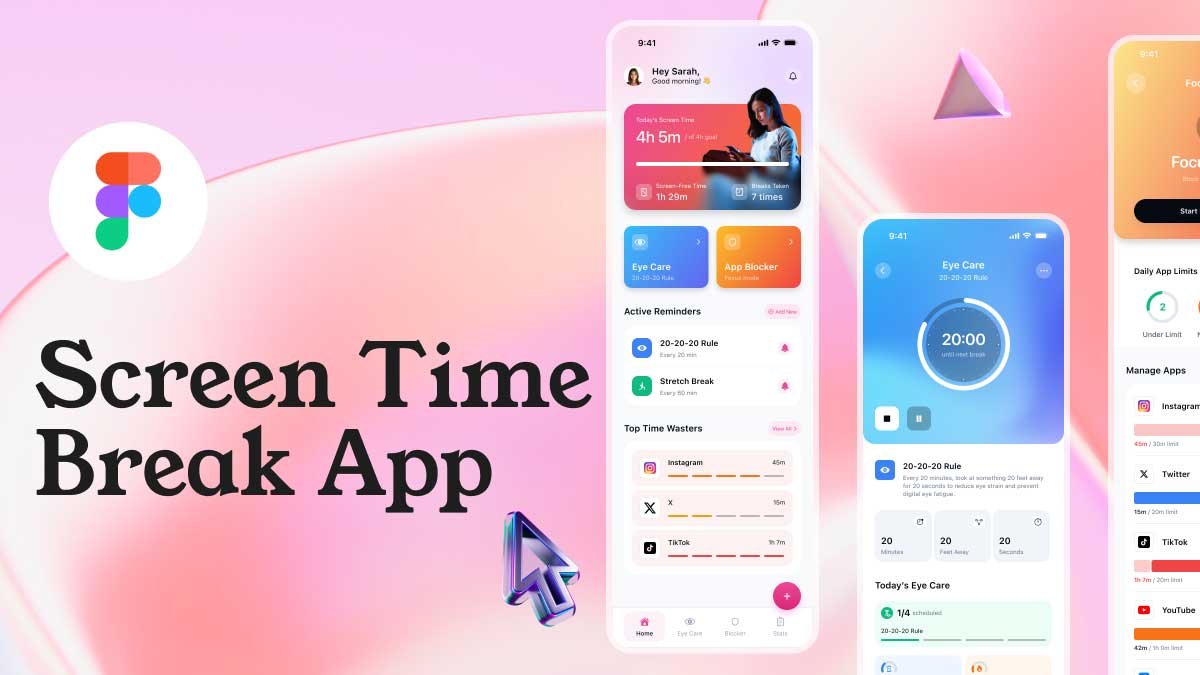
In this Figma tutorial, we will guide you step by step on how to create button variants using Figma components and variants in design system. Whether you’re a beginner or looking to enhance your UI design workflow, this guide will help you create button variants for small, medium, and large sizes with different styles, including symbols + text, only symbols, and only text. We will use Auto Layout to ensure scalability and consistency.
To learn Figma, UI/UX design, web design, mobile app ui design, responsive design, no-code development, and AI-powered tools, and to download premium quality UI kits, Check out my YouTube channel (@uixDesignAcademy) for simple and easy beginner tutorials!
Why Use Button Variants in Figma?
Creating button variants in Figma allows designers to maintain consistency, improve efficiency, and speed up the design process. Instead of manually creating different button styles for each screen, button variants enable you to switch between styles effortlessly within a single component. This helps in keeping your design system organized and easy to manage.
Step 1: Creating the Base Button Component
- Open Figma and create a new frame.
- Select the Rectangle Tool (R) and draw a button shape.
- Set the button size:
- Small: 80×32 px
- Medium: 120×40 px
- Large: 160×48 px
- Apply Auto Layout (Shift + A) to the button, ensuring proper spacing and alignment.
- Add text inside the button and center it using Auto Layout properties.
- Style the button with colors, shadows, and rounded corners as per your design requirements.
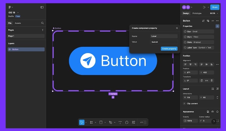
Step 2: Converting the Button into a Component
- Select the button and text layer.
- Click on Create Component (Ctrl + Alt + K / Cmd + Option + K on Mac).
- Name your component Button / Default for better organization.
- Now, we will create different button variants within this component.
Step 3: Adding Variants for Button Sizes
- With the component selected, click on Add Variant in the right panel.
- Duplicate the button and rename the first variant as Small, the second as Medium, and the third as Large.
- Adjust the width and height for each variant accordingly.
Step 4: Creating Button Variants with Symbols + Text, Only Symbol & Only Text
- Symbol + Text Variant:
- Add an icon to the button (e.g., a plus sign or an arrow).
- Ensure the icon and text align properly using Auto Layout.
- Only Symbol Variant:
- Remove the text and keep only the symbol.
- Center the symbol using Auto Layout settings.
- Only Text Variant:
- Remove the symbol and adjust the padding for a clean look.
Step 5: Organizing Variants in Figma
- Select all button variations.
- In the right panel, define Variant Properties, such as:
- Size: Small, Medium, Large
- Style: Text + Symbol, Symbol Only, Text Only
- Now, when you use this button component, you can switch between different button variants from the Instance Panel.
Step 6: Testing and Using Button Variants
- Drag the button component into your design.
- Use the Properties Panel to switch between different button variants.
- Ensure proper spacing and alignment for a consistent look.
Summary
By following this step-by-step guide, you have successfully created button variants in Figma using components, variants, and Auto Layout. This method ensures a scalable and flexible design system while improving efficiency. Now, you can easily switch between small, medium, and large buttons with different styles like symbols + text, only symbols, and only text.
Practicing with button variants will help you streamline your UI design process and make your designs more responsive and adaptable. Keep experimenting with colors, hover states, and additional properties to create a fully interactive button system in Figma!
If you’re beginners and want to learn ui/ux design so join our 100 days ui design challenge
