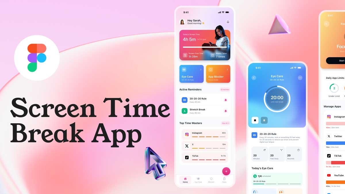
Create Component Properties in Figma by learning how to master Figma components and take your design skills to the next level! In this tutorial, we’ll show you how to create components properties in figma, variants, and properties step-by-step. You’ll also learn how to design components and variants for input fields and buttons, making your workflows faster and more efficient. Perfect for UI/UX designers looking to streamline their design process.
To learn Figma, UI/UX design, web design, mobile app ui design, responsive design, no-code development, and AI-powered tools, and to download premium quality UI kits, Check out my YouTube channel (@uixDesignAcademy) for simple and easy beginner tutorials!
Understanding Components in Figma
Figma components are reusable design elements that help maintain consistency across a design system. Whether you’re working on a simple button or a complex form, components ensure uniformity while saving time.
Create component properties in Figma is the foundation of a scalable design system. With component properties, designers can easily adjust elements without duplicating or manually editing multiple instances.
What are Component Properties in Figma?
When you create component properties in Figma, you define customizable attributes that make your design system more flexible and dynamic. These properties allow you to control text, images, visibility, and interactions within a component.
Using component properties, designers can:
- Modify text labels dynamically.
- Toggle visibility for optional elements.
- Switch between icons, themes, or styles within a single component.
- Enhance collaboration by ensuring consistency in UI elements.
Creating Components and Variants in Figma
Step 1: Creating a Base Component
- Design an element (e.g., a button or input field).
- Select the element and click Create Component in the toolbar.
- Name your component appropriately to keep your design system organized.
Step 2: Adding Variants to a Component
- With the base component selected, click Add Variant in the properties panel.
- Modify the duplicated component to create an alternative version (e.g., different colors, states, or sizes).
- Use the Variant Grouping feature to keep related components together.
Variants allow designers to switch between different states like hover, active, or disabled modes without duplicating separate components.
Setting Up Component Properties
Step 1: Defining Text Properties
- Select your component and go to the Properties Panel.
- Click Add Property > Text.
- Name the property (e.g., “Button Label”) and set the default text.
- Now, when using this component, you can edit the text dynamically without detaching it.
Step 2: Adding Boolean Properties for Visibility
- Select an optional element inside your component (e.g., an icon in a button).
- In the Properties Panel, click Add Property > Boolean.
- Name it (e.g., “Show Icon”) and set the default state.
- This allows users to toggle the icon on or off while keeping the component intact.
Step 3: Using Instance Swap Properties
- Select an icon or image within your component.
- Click Add Property > Instance Swap.
- Name it (e.g., “Icon Type”) and assign different icons.
- Now, users can swap icons without changing the component structure.
Designing Components and Variants for Buttons and Input Fields
Creating Button Variants
- Design a primary button and convert it into a component.
- Create variants for different states:
- Default
- Hover
- Pressed
- Disabled
- Use Boolean properties to toggle an optional icon inside the button.
- Apply text properties to make button labels dynamic.
Designing Input Field Variants
- Create a text input field with a label and placeholder.
- Convert it into a component.
- Add variants for different states:
- Default
- Focused
- Error
- Disabled
- Use Boolean properties to show or hide an error message.
- Apply text properties for dynamic placeholder text.
Best Practices to Create Component Properties in Figma
- Keep your design system structured – Organize components properly for easy accessibility.
- Use meaningful names – Label component properties clearly to enhance usability.
- Minimize overrides – Avoid unnecessary customization to maintain consistency.
- Test variations – Check different states to ensure seamless interactions.
Summary
By learning how to create component properties in Figma, you can significantly enhance your design workflow. Mastering components, variants, and properties enables UI/UX designers to build scalable and efficient design systems. Whether working on buttons, input fields, or other interactive elements, using Figma’s powerful features will save time and improve design consistency.
Start experimenting with Figma components today and take your design system to the next level with create component properties in figma!
Interested to learn how to create button variants in figma?


