100 Days of Daily UI Design Challenge: Day 2 – Creating the Ultimate Checkout Page
Welcome back to the Daily UI Design Challenge! If you completed Day 1’s task, congratulations—you’re off to a strong start. Today, we’re diving into another essential UI element: the checkout page. This is a crucial step in the user journey, where design meets functionality to drive conversions and ensure a smooth user experience.
To learn Figma, UI/UX design, web design, mobile app ui design, responsive design, no-code development, and AI-powered tools, and to download premium quality UI kits, Check out my YouTube channel (@uixDesignAcademy) for simple and easy beginner tutorials!
Why Focus on the Checkout Page?
The checkout page is where the magic happens—or doesn’t. A poorly designed checkout process can frustrate users and lead to cart abandonment, while a well-designed page can boost trust and increase sales. Here’s why this challenge is important:
Enhance Usability: Streamlined checkout experiences reduce friction.
Increase Conversions: A clear and engaging design helps users complete their purchases.
Build Trust: Elements like security badges and clear payment options reassure users.
Practice Complex Design: Designing a checkout page combines UI elements like forms, buttons, and progress indicators.
Stand Out: Exceptional checkout designs can differentiate your product in a competitive market.
Day 2: Designing the Checkout Page
Creating an effective checkout page involves balancing aesthetics with functionality. Here are the key elements and steps to nail your design.
1. Essential Features of a Great Checkout Page
Clear Progress Indicators: Show users where they are in the checkout process.
Simple Form Fields: Minimize input requirements and use autofill wherever possible.
Payment Options: Provide multiple methods, like credit card, PayPal, and Apple Pay.
Order Summary: Display a clear breakdown of items, prices, and totals.
Call-to-Action Buttons: Make “Place Order” or “Continue” buttons prominent and visually distinct.
Trust Signals: Add security icons, refund policies, and customer support links.
2. Design Goals for the Checkout Page
When designing your checkout page, prioritize:
Clarity: Use concise text and clear labels to guide users.
Speed: Optimize for quick loading times and effortless navigation.
Responsiveness: Ensure the page looks great and functions well on all devices.
Accessibility: Include features like keyboard navigation and screen reader compatibility.
3. Step-by-Step Approach
Here’s how to structure your design process:
Plan the Layout: Sketch a wireframe with sections for the order summary, payment details, and CTA buttons.
Choose a Color Scheme: Use colors that align with the brand but also draw attention to critical elements like the “Pay Now” button.
Optimize Form Design: Use dropdowns, radio buttons, and autofill suggestions to simplify input.
Add Feedback Elements: Show real-time validation for form fields and confirmation messages post-purchase.
Test the Flow: Simulate user scenarios to ensure a seamless experience.
4. Tools and Inspiration for Checkout Design
Here are some resources to help you craft an amazing checkout page:
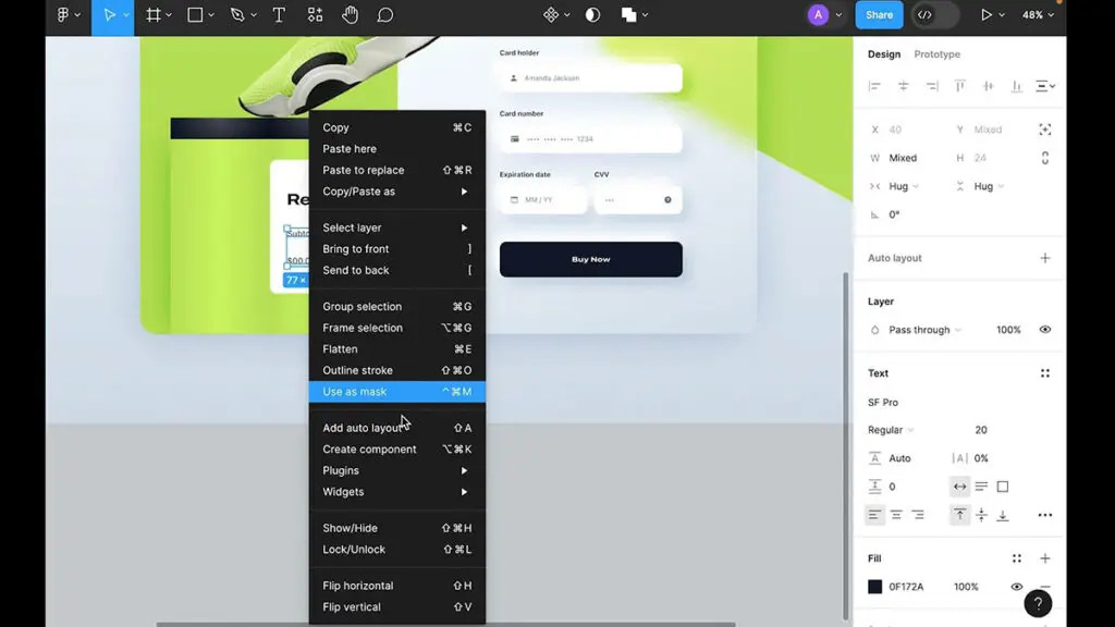
Design Tools: Use Figma, Sketch, or Adobe XD to create your mockups.
UX Patterns: Refer to Baymard Institute’s checkout research for best practices.
Inspiration Sources: Explore checkout designs on Dribbble and Behance.
UI Kits: Leverage free or premium UI kits tailored for e-commerce designs.
Share Your Work and Learn
Once you’ve completed your Day 2 challenge, don’t forget to share your design! Use platforms like Dribbble, Twitter, or Instagram, and tag your post with #DailyUI. Engage with the community to receive feedback and exchange ideas.
Ask yourself:
Does the design simplify the checkout process?
Is the order summary clear and detailed?
Are the payment options and CTA buttons intuitive?
Want to Learn How I Designed This?
Curious about my approach to the Day 2 challenge? I’ve created a detailed video tutorial showing the entire process of designing a user-friendly checkout page. Click on below Watch full tutorial button and follow along to see how it all comes together!
Looking Ahead
You’ve tackled one of the most critical UI components—great job! Tomorrow, we’ll take on a new challenge that will push your creativity even further. Stay consistent, and remember, it’s all about progress over perfection.
Keep learning and designing — head back to the Daily UI Challenge overview to discover more UI tasks with free Figma files.