
In today’s digital-first world, an effective and user-friendly e-commerce UI design is essential for retaining customers and enhancing their shopping experience. In this blog post, we’ll dive into the design flow of a basic e-commerce app named GLOW, created in Figma. The design includes three core screens: Home, Details, and Cart. Each screen has been meticulously crafted to ensure a seamless and intuitive user experience. Let’s break down the elements of each screen and explore how they contribute to an optimal e-commerce journey.
To learn Figma, UI/UX design, web design, mobile app ui design, responsive design, no-code development, and AI-powered tools, and to download premium quality UI kits, Check out my YouTube channel (@uixDesignAcademy) for simple and easy beginner tutorials!
E-commerce UI Design – Home Screen
The Home screen of the e-commerce ui design serves as the entry point for users, setting the tone for the entire shopping experience. Here’s a detailed breakdown:
Navigation Bar:
Positioned at the top, the navigation bar features three critical elements:
A hamburger menu on the left for easy access to additional options.
The GLOW app name in the center, styled with a glowing effect to draw attention and reinforce branding.
A cart icon on the right, providing users with a quick view of their shopping cart.
Search Field and Filter Icon:
Below the navigation bar, a prominently placed search field allows users to find products effortlessly.
A filter icon adjacent to the search bar enables users to refine their search results by categories, price, or other criteria.
Product Categories:
A horizontal list of product categories is displayed below the search field. This feature makes it convenient for users to explore items based on their preferences.
Popular Products Section:
This section showcases trending items in a horizontal scrollable format. Users can swipe left or right to browse through the popular products, encouraging discovery.
Tab Bar:
At the bottom, the tab bar features three essential icons: Home, Wishlist, and User. These provide quick navigation to other key areas of the app, ensuring a user-centric design.
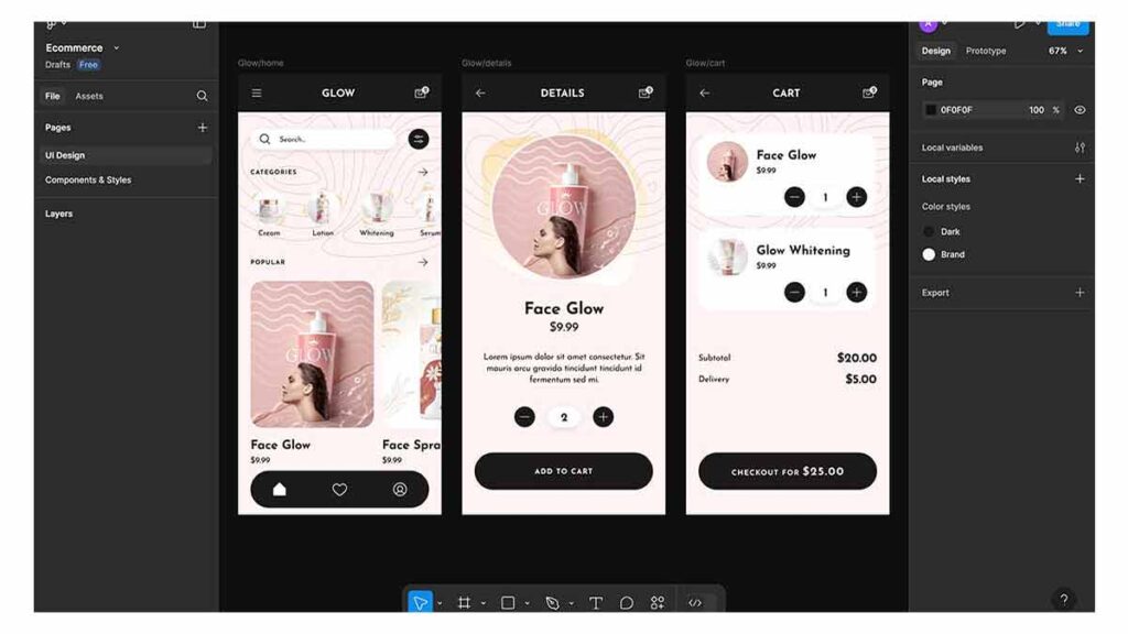
Details Screen Design
The Details screen of the e-commerce ui design is where users can view product-specific information. Its clean and concise layout ensures users can make informed decisions without feeling overwhelmed.
Navigation Bar:
A back button on the left allows users to return to the previous screen easily.
The text “Product Details” in the center clearly indicates the purpose of the page.
The cart icon on the right ensures users can access their cart at any time.
Product Image:
A large circular image of the product takes center stage. The visual appeal of this layout enhances product focus and encourages engagement.
Product Information:
Below the image, essential details are displayed, including:
Product name.
Price.
A brief description.
Quantity Selector:
Users can increase or decrease the quantity using “-” and “+” buttons, which are placed alongside the selected quantity for convenience.
Add to Cart Button:
A prominently placed “Add to Cart” button at the bottom ensures users can quickly proceed to the next step in their shopping journey.
Cart Screen Design
The Cart screen of the e-commerce ui design finalizes the user’s shopping experience by summarizing their selected items and enabling checkout.
Navigation Bar:
Similar to other screens, the cart screen features a back arrow on the left and a cart icon on the right. The centered text “Cart” clarifies the screen’s purpose.
Product List:
A detailed list of items added to the cart is displayed, including product names, images, quantities, and prices. This transparency builds user trust.
Pricing Summary:
Below the product list, a summary displays:
Subtotal.
Delivery fees.
The total amount.
Checkout Button:
A bold and visually distinct “Checkout” button at the bottom allows users to complete their purchase effortlessly. The total amount is displayed prominently alongside the button
Why This Design Works
The GLOW app’s 3-screen app flow of e-commerce ui design has been designed with usability and simplicity in mind. Key elements that contribute to its effectiveness include:
Consistency Across Screens:
The navigation bar maintains uniformity, making it easy for users to navigate between screens.
Clear Visual Hierarchy:
The most critical elements, such as the search bar, product image, and checkout button, are prominently placed to guide user attention.
User-Centric Features:
Features like the quantity selector and filter icon enhance functionality and cater to user needs.
Responsive Design:
Horizontal scrolling and clear categorization ensure a mobile-friendly and responsive layout.
Conclusion
Designing an effective e-commerce UI design requires a deep understanding of user needs and behaviors. The GLOW app’s Home, Details, and Cart screens are prime examples of how simplicity and functionality can enhance the shopping experience. By focusing on clear navigation, intuitive layouts, and visually appealing elements, this design ensures users can shop with ease and confidence.
Whether you’re a budding designer or an experienced developer, the principles applied in this 3-screen flow can serve as a foundation for creating impactful e-commerce experiences. Start designing your next project with these insights and take your UI skills to the next level!
If you want to learn and grow your skill, Watch our series of 100 days – daily ui design challenge,