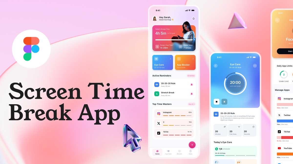
Icons play a crucial role in UI/UX design, enhancing usability and aesthetics. In this video, I’ll show you how to create a Figma Icon Design with the 8pt Grid System to achieve a clean, consistent, and scalable layout.
Why Use the Figma Icon Design with 8pt Grid System?
The 8pt Grid System ensures precise alignment, equal spacing, and a well-structured design. When designing icons in Figma, following this grid system helps maintain visual balance and improves scalability across different screen sizes.
Key Highlights of This Figma Icon Design with 8pt Grid System:
✅ Perfect Grid Alignment: Icons follow the 8pt rule for consistency.
✅ Vibrant Colors: A carefully selected color palette enhances visibility.
✅ Scalability & Clarity: Icons remain sharp at various sizes.
🎨 Watch the full tutorial to learn step-by-step how to design professional icons in Figma using the 8pt Grid System!
Want a hands-on demonstration? Watch my YouTube tutorial to learn Figma, UI/UX design for mobile app ui, Check out 100 days daily ui challenge for simple and easy beginner tutorials!


