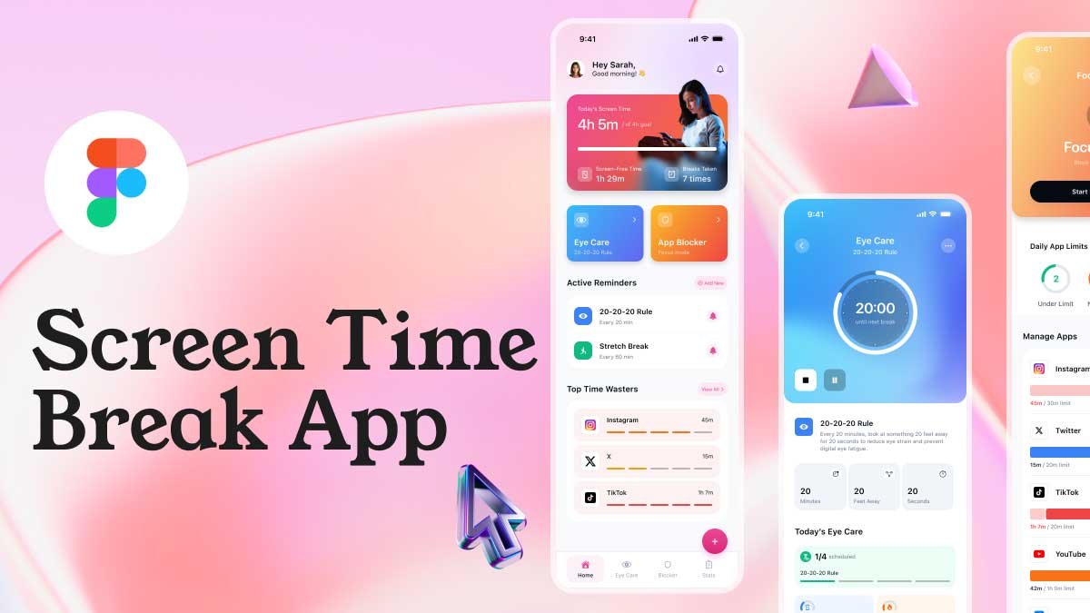
What is a Figma Tutorial?
A Figma tutorial is a step-by-step guide that helps designers create UI/UX designs and interactive prototypes using Figma. In this tutorial, we will walk you through the process of designing and prototyping a product card for an e-commerce website. By the end, you’ll understand how to create a visually appealing UI component and bring it to life using Figma’s prototyping features.
Step 1: Setting Up Your Figma Canvas
Before you start designing, open Figma and create a new frame (Artboard) to set up your design space. Choose a size that fits your project, such as 1080×1920 pixels for a mobile layout or 1200×800 pixels for a web interface.
Step 2: Designing the Product Card in Figma
1. Create the Card Background
- Use the Rectangle Tool (R) to draw a card with rounded corners.
- Apply a soft shadow to give a 3D effect.
- Use a gradient or solid color background that complements the overall UI design.
2. Add the Product Image
- Import a high-quality product image (e.g., a shoe) and place it on the card.
- Use the Remove Background feature (external tool) if needed for a clean cutout.
- Position the product creatively, like making it appear floating for a modern UI look.
3. Add Product Details
- Use the Text Tool (T) to add the product title (e.g., “Men’s Running Shoes”).
- Display the price prominently (e.g., “$55.99”).
- Apply a bold font for the title and a slightly smaller size for the price to create a visual hierarchy.
4. Include Color Variants
- Design color selection buttons using small circular shapes.
- Use Figma’s auto layout and alignment tools to space them evenly.
- Add a hover effect or border to indicate the selected color.
Step 3: How to Prototype a Product Card in Figma
1. Adding Interactions in Figma
Since we have designed the card in Figma, the next step is to add interactions to make it fully functional:
- Select the color variant buttons and go to Prototype mode.
- Create on-click interactions that swap the product image based on the selected color.
- Add smooth transitions to improve the user experience.
2. Animating the Product Image
- Use Smart Animate to create a hover effect or a sliding animation.
- Adjust easing settings to make transitions more natural.
- Test the animation by clicking the Present button.
Step 4: Exporting Your Figma Design
Once your Figma tutorial project is ready, export the assets:
- Select your product card and go to File > Export.
- Choose PNG, JPG, or SVG based on your needs.
- Share the Figma link with your team or client for feedback.
This Figma tutorial covered how to design and prototype a product card using UI/UX best practices. Since the entire design and prototyping were done in Figma, you now have a fully interactive product card that can be used for e-commerce projects. By implementing Figma’s Smart Animate and interactive prototyping, you can enhance user experience and make your UI more dynamic. Try experimenting with different layouts and animations to refine your skills!
Related Figma Tutorials
To learn Figma, UI/UX design, web design, mobile app ui design, responsive design, no-code development, and AI-powered tools, and to download premium quality UI kits, Check out my YouTube channel (@uixDesignAcademy) for simple and easy beginner tutorials


