Overview of the Free Travel Landing Page
If you’re designing a modern, clean, and responsive travel website, this Free Figma Landing Page Template is a perfect resource. It includes all the key sections needed for a real-world landing page—from eye-catching hero banners to featured destinations and a newsletter CTA.
The best part? It’s completely free to download and fully editable in Figma.
Who Should Use This Free Template
This resource is ideal for:
- UI/UX beginners learning how to structure layouts using a Free Figma Landing Page Template
- Freelance designers building websites for travel clients
- Design students needing high-quality templates for practice
- Content creators or travel bloggers who want to prototype landing pages
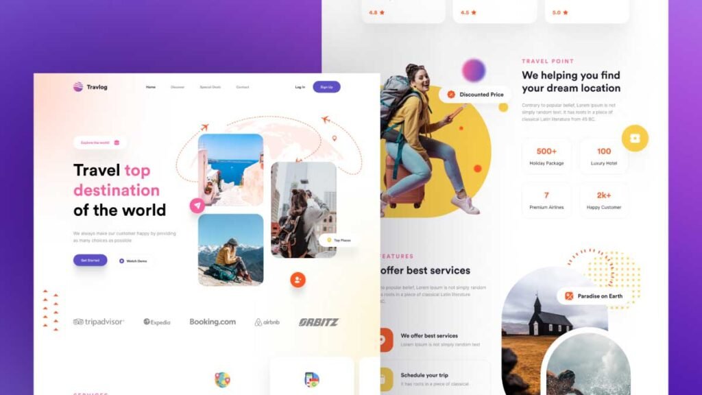
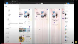
Detailed Layout Breakdown: Section by Section
Let’s walk through each section of the Free Figma Landing Page Template — as seen in the image above — so you understand what’s included and how it works:
1. Header / Navigation Bar
- Simple logo area on the left
- Navigation links: Home, Destinations, About, Contact
- A highlighted call-to-action button: Book Now
This header is clean, with intuitive navigation, making it perfect for first-time users.
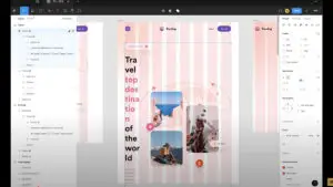
2. Hero Section
- Full-width background image (travel-themed with overlay)
- Bold headline: “Discover the World with Us”
- Subheading with travel inspiration
- CTA button: Explore Now
The hero section immediately captures attention and sets the tone for the rest of the site.
3. Featured Destinations
- 3–4 destination cards in a grid layout
- Each card includes:
- Beautiful travel photo
- Location name
- Short tagline or travel quote
This section is designed to inspire users and drive clicks to explore more about each location.
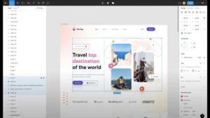
4. Travel Benefits Section
- 3 horizontal cards or icons with:
- Best Price Guarantee
- 24/7 Support
- Custom Travel Packages
Perfectly explains key features or services offered by the travel company.
5. Popular Packages
- Grid-style layout with cards for each travel package
- Includes:
- Destination title
- Price
- Duration
- Star ratings
- “View Details” button
This section clearly shows travel packages and makes it easy for people to book a trip.
6. Testimonials / Reviews
- User photo, name, and a short review
- Star ratings and traveler experiences
- Design uses carousel or static card layout
Showing reviews or feedback here helps new visitors feel confident and trust your service.
7. Call to Action (CTA)
- Bold text with a high-contrast button
- Message like: “Ready to start your journey?”
A simple and clear button here helps visitors know what to do next, like booking or signing up.
8. Newsletter Sign-Up
- Email field and subscribe button
- Brief message like: “Get travel deals and tips in your inbox!”
Perfect for building an email list and offering future promotions.
9. Footer
- Company logo
- Quick links: Terms, Privacy, FAQs
- Social media icons
A clean, useful footer that closes the layout professionally.
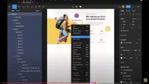
Step-by-Step Tutorial: How to Design a Landing Page in Figma
In the YouTube video tutorial, I walk you through every step of designing this layout in Figma. Here’s a summary:
1. Set Up the Frame
- Use 1440px wide desktop layout
- Add a 12-column grid for alignment
- Set padding/margins consistently
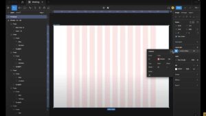
2. Add Sections One by One
- Use rectangles and text blocks for layout
- Align hero section elements centrally
- Use auto layout and grouping for consistency
3. Add Images, Icons, and Styles
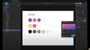
- Use royalty-free travel images
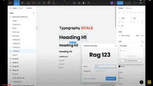
- Define global styles for:
- Colors (blue, orange, white)
- Typography (Inter, Poppins, etc.)
- Buttons and CTAs
4. Turn Repeated Items into Components
- Create button components and reuse across sections
- Maintain a clean layer structure and naming
📺 Watch the full design process:
👉 Travel Landing Page Design in Figma
Making the Design Responsive
In the second part of the tutorial, I make the same layout responsive for tablet and mobile:
What’s Covered:
- Resizing layout for tablet (768px) and mobile (375px)
- Using constraints and auto layout
- Stacking sections vertically and resizing text/buttons
- Keeping UX consistent across devices
📺 Watch the responsive tutorial:
👉 Make the Landing Page Responsive in Figma
Download the Figma File
You can download the full editable file below:
Watch the Full Tutorial on YouTube
This landing page was created live on YouTube. If you’re new to Figma, this video is a great beginner guide.
📺 Full Design Walkthrough and Responsive Design Tutorial: Watch Now
Final Thoughts
This Free Figma Landing Page Template is perfect for UI/UX designers, freelancers, and students learning layout design and responsiveness. With clean structure, powerful visuals, and best practices in action, you can learn a lot by studying or customizing it.
👉 Explore more free Figma resources here, and don’t forget to subscribe on YouTube for more weekly design tutorials.