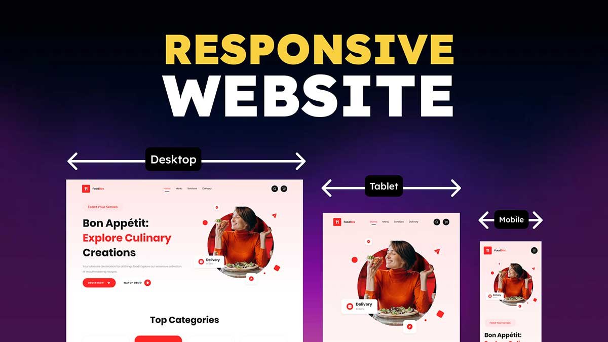
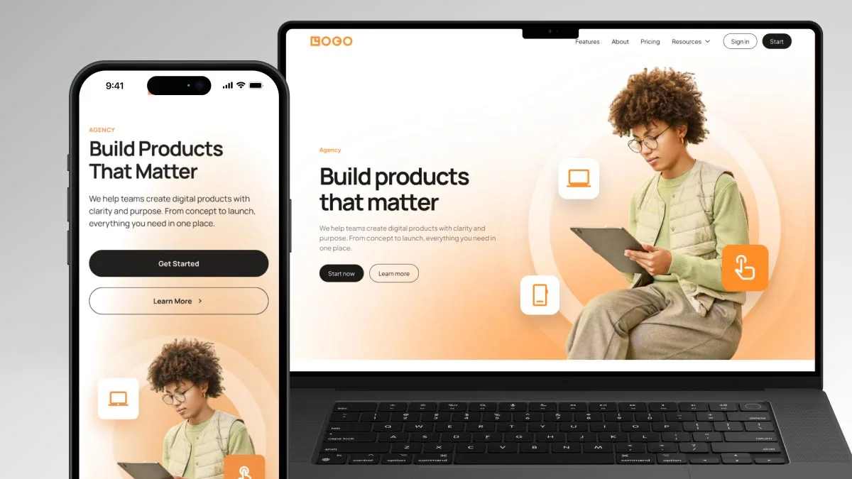
In today’s digital world, having a responsive website is crucial for delivering a seamless user experience across different devices. Whether you are designing a responsive website template, or simply trying to learn responsive design, Figma provides powerful tools to achieve this. In this article, we’ll walk through how to make a best responsive website for a food-related business using Figma.
To learn Figma, UI/UX design, no-code development, and AI-powered tools, and to download premium quality UI kits, Check out my YouTube channel (@uixDesignAcademy) for simple and easy beginner tutorials!
What is a Responsive Website?
A responsive website adapts to different screen sizes, ensuring that the content looks great on desktops, tablets, and mobile devices. This is achieved using flexible layouts, scalable images, and media queries. When you’re designing a responsive website template, understanding Figma’s approach to responsive design is essential.
Why Use Figma for Responsive Web Design?
Figma is a powerful design tool that allows designers to create responsive website layouts with ease. It offers features like:
- Auto Layout for dynamic resizing
- Constraints to define how elements adjust to different screen sizes
- Frames and Components to maintain consistency
- Prototyping tools to visualize responsiveness
By leveraging these tools, designers can learn responsive design effectively and create user-friendly food websites.
Step-by-Step Guide to Creating a Responsive Design in Figma
1. Plan Your Layout
Before diving into Figma, outline the key sections your food website will include. Common sections are:
- Hero Section: A visually appealing banner with a call-to-action
- Menu Section: Showcasing food categories and popular dishes
- About Section: Brief details about the restaurant or food business
- Testimonials: Customer reviews and ratings
- Contact Section: Address, social links, and an inquiry form
2. Set Up Your Figma File
- Open Figma and create a new Frame with a Desktop (1440px width) layout.
- Use Auto Layout for flexible designs.
- Add grids and columns to align elements properly.
3. Use Auto Layout for Flexibility
Auto Layout in Figma allows your elements to adjust dynamically. When designing a best responsive website, use Auto Layout for:
- Buttons
- Navigation bars
- Product lists
- Pricing tables
This ensures that when the screen size changes, the elements adjust accordingly.
4. Apply Constraints to Maintain Responsiveness
Figma’s Constraints feature ensures elements resize proportionally. For example:
- Set images to scale proportionally.
- Keep text boxes pinned to maintain alignment.
- Use centered content for a balanced look.
These techniques help when transitioning to responsive website HTML development.
5. Design for Multiple Screen Sizes
To make a design responsive for all devices, create versions for:
- Desktop (1440px width)
- Tablet (768px width)
- Mobile (375px width)
Adjust font sizes, spacing, and images accordingly to ensure a smooth user experience.
6. Export Assets for Development
Once the design is complete, export assets for responsive website HTML coding. Optimize images and icons to reduce load time and enhance performance.
Best Practices for Food Website Responsive Design
Use a Mobile-First Approach
Designing for smaller screens first ensures a seamless experience when scaling up to larger screens.
Optimize Images for Faster Loading
Use compressed images and SVGs for icons to enhance performance on mobile devices.
Ensure Touch-Friendly Elements
Buttons and links should be large enough for easy interaction on touch devices.
Use a Responsive Website Template
If you’re new to designing, starting with a responsive website template can help you build a structured layout faster.
Conclusion
Creating a responsive web design in Figma for a food business ensures an excellent user experience across all devices. By implementing Auto Layout, constraints, and multiple screen sizes, you can learn responsive design effectively. Whether you’re building a responsive website template, Figma simplifies the process, making it easier to create the best responsive website for your food business.
Want to learn how I designed this stunning food landing page in Figma?
Explore UI/UX principles, layout techniques, color psychology, and typography to see the full design process and tips!