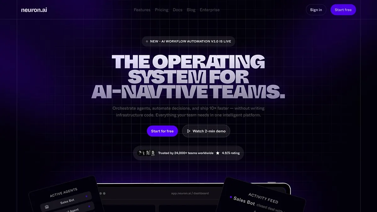
Creating a professional landing page design in Figma is an essential step for any UI/UX designer who wants to build clean, modern, and conversion-focused websites. In today’s Daily UI Challenge Day 03, I designed a landing page in Figma (Urdu/Hindi tutorial) that focuses on simplicity, strong visuals, and a clear call-to-action.
This landing page example highlights how good design can improve user experience and boost engagement. Whether you’re working on a SaaS product, portfolio, or business website, understanding landing page structure is key.
Why Landing Page Design in Figma Matters
When it comes to UI design, Figma is one of the best tools because it allows designers to create responsive layouts, manage typography, and maintain consistency with reusable components. By working through this Daily UI Challenge, you’ll learn how to:
- Build a clean hero section with strong typography
- Add call-to-action buttons like “Start free trial” or “Watch demo”
- Organize content blocks for features, pricing, and testimonials
- Apply modern UI design trends such as gradients, vibrant colors, and shadows
In this challenge, I also experimented with a dark mode landing page UI, using a vibrant purple color palette. The combination of deep backgrounds with bright accent colors makes the design stand out and feel more engaging.
What’s Included in the Freebie?
- ✅ Fully layered and editable Figma file
- ✅ Organized components and auto-layouts
- ✅ Free to use for practice or inspiration
- ✅ Dark mode landing page design with modern UI trends
- ✅ Easy to customize for your own projects
Daily UI Challenge Day 03 – My Approach
For Day 03 of the Daily UI Challenge Landing Page Design in Figma, I focused on creating a landing page that balances aesthetics with usability. The main goal was to make the design visually appealing while still easy for users to navigate. By using Figma auto-layoutand components, the design process became faster and more structured.
If you’re following along with this challenge, try creating your own version of a landing page. Start with a simple wireframe, then gradually refine it with typography, spacing, and color. The more you practice, the better you’ll get at designing websites that are both functional and beautiful.
This post is part of my ongoing Daily UI Challenge in Figma (Urdu/Hindi tutorials). If you’d like to learn more about ui/ux design, you can checkout my YouTube channel for uix design academy download the source file and explore the design in detail, check out the freebie link below. 🚀