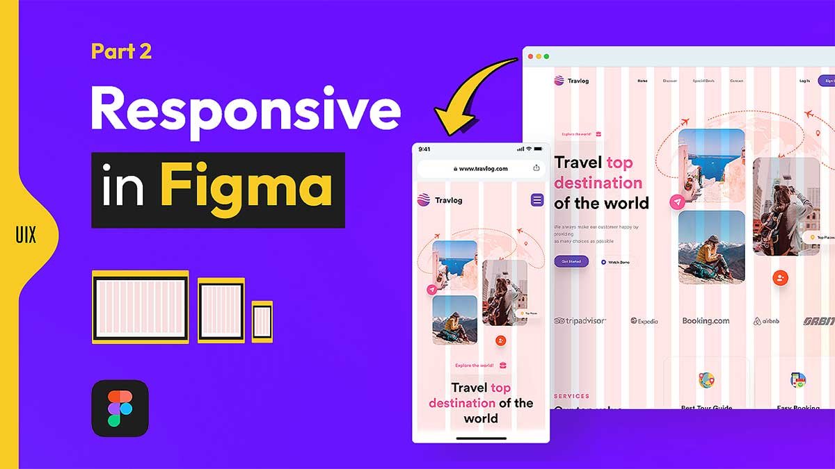
Want to master responsive web design in Figma? In this free travel landing page template and tutorial, I’ll show you exactly how to turn a desktop travel landing page into a fully responsive layout for tablet and mobile. Download the editable Figma file and follow the YouTube tutorial to make your designs look great on every device.
To learn Figma, UI/UX design, web design, mobile app ui design, responsive design, no-code development, and AI-powered tools, and to download premium quality UI kits, Check out my YouTube channel (@uixDesignAcademy) for simple and easy beginner tutorials!
What is Responsive Web Design?
Responsive web design is an approach to web design that ensures a website adjusts smoothly to any screen size or device. Whether a user is browsing on a smartphone, tablet, or desktop, a responsive design automatically adapts to fit the screen, without any horizontal scrolling or awkwardly scaled elements.
Gone are the days when websites were designed only for desktop use. Now, with mobile-first indexing and a growing number of users accessing websites from mobile devices, creating a responsive site is a must. If your website isn’t optimized for mobile, you could lose out on valuable traffic and conversions.
Freebie Overview
This freebie is Part 2 of the travel landing page project. It focuses entirely on responsive web design — adapting your desktop layout for tablets and smartphones while keeping the style, spacing, and user experience consistent.
Features / What’s Included
- Fully responsive travel landing page design
- Desktop (1440px), tablet (768px), and mobile (375px) layouts
- Organized Figma file with components and auto layout
- Consistent typography, colors, and spacing
- Free for personal and commercial use
💡 If you missed Part 1, where we designed the desktop version from scratch, check out the Web Design in Figma blog post here for the full process before moving to responsive design.