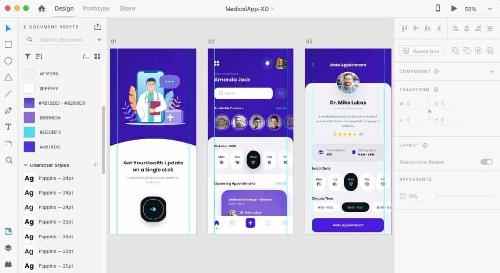
Creating a user-friendly and visually appealing medical app UI is essential to ensure seamless interaction for patients and doctors alike. In this blog, we will explore the design process for a medical app UI using Adobe XD, focusing on the key screens that provide a smooth user experience. Whether you’re designing for healthcare professionals or patients, these screens are critical to making your app stand out.
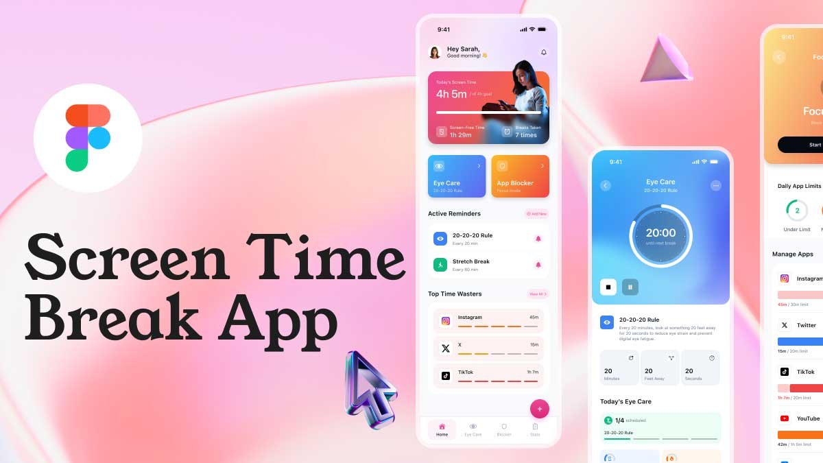
To learn Figma, UI/UX design, web design, mobile app ui design, responsive design, no-code development, and AI-powered tools, and to download premium quality UI kits, Check out my YouTube channel (@uixDesignAcademy) for simple and easy beginner tutorials!
Why Choose Adobe XD for Medical App UI Design?
Adobe XD is a versatile tool that allows designers to prototype, collaborate, and create stunning interfaces with ease. For a medical app, it offers:
Ease of prototyping: Quickly test user flows and interactions.
Collaboration tools: Work seamlessly with developers and stakeholders.
Scalability: Design adaptable layouts for different devices.
The medical app UI will guide us as we discuss the following core screens: Get Started, Home, and Doctor Profile.
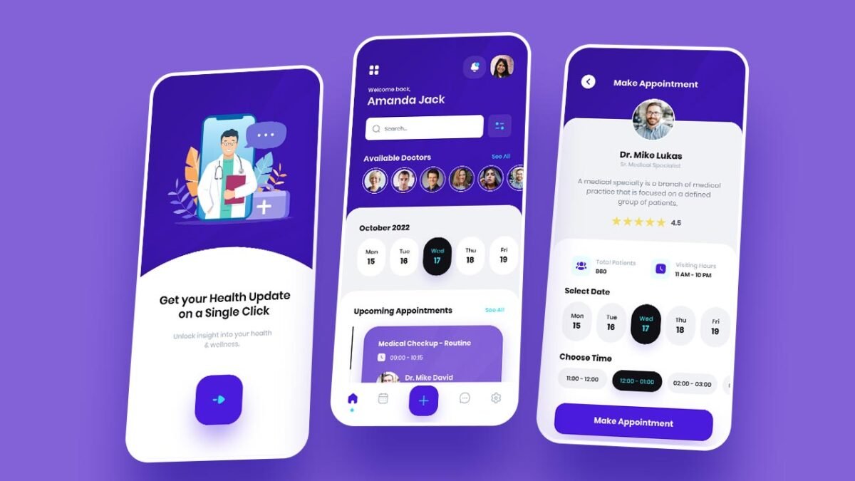
1. Get Started Screen
The Get Started screen is the user’s first interaction with your app, setting the tone for their experience. Here’s how to design an effective Get Started screen:
Key Features:
Description: A concise explanation of the app’s purpose, e.g., “Easily book appointments, access doctor profiles, and manage your healthcare needs.”
Call-to-Action: A prominent “Continue” button invites users to proceed.
Design Tips:
- Use dark blue and teal colors to align with your brand’s medical theme. These colors convey trust and reliability.
- Keep the layout minimal to avoid overwhelming new users.
- Utilize large, readable fonts to enhance accessibility.
Example in Adobe XD:
- Add a background gradient with dark blue transitioning to teal.
- Center-align the text and button for a balanced look.
- Include subtle icons or illustrations related to healthcare.
2. Home Page
The Home Page acts as the central hub, offering users quick access to essential features. This screen must balance functionality and aesthetics.
Key Features:
Navigation Bar: At the bottom, include buttons for Home, Calendar, Create Appointment, Chat, and Settings.
Search Bar: Allow users to find doctors effortlessly.
Profile and Notifications: Icons for personal settings and important updates.
Doctors List: Display available doctors with their specialties.
Upcoming Appointments: Highlight upcoming consultations using card-based design.
Design Tips:
- Use a grid layout in Adobe XD to organize content systematically.
- Incorporate hover effects or subtle animations to enhance interactivity.
- Utilize icons alongside text labels for better navigation.
Example in Adobe XD:
- Create a fixed bottom navigation bar with rounded buttons and teal accents.
- Add a week calendar horizontally scrollable at the top.
- Design a card layout for the “Upcoming Appointments” section with doctor names, times, and appointment details.
3. Doctor Profile Screen
The Doctor Profile screen provides detailed information about a doctor, empowering users to make informed decisions.
Key Features:
Doctor Picture and Bio: A professional headshot with a brief bio.
Ratings and Patient Count: Indicate credibility with a star rating system and total patients attended.
Visiting Hours: Specify available time slots.
Book Appointment Button: Ensure it’s prominently displayed for easy access.
Design Tips:
- Use circular frames for doctor pictures to maintain a clean aesthetic.
- Highlight the “Book Appointment” button with a teal background and rounded corners.
- Arrange information hierarchically, starting with the doctor’s name and bio.
Example in Adobe XD:
- At the top, place the doctor’s picture and name in bold typography.
- Below, add a star rating component and patient stats using iconography.
- Design a calendar section for selecting dates and time slots, incorporating teal accents for active selections.
Using Brand Colors Effectively
The dark blue and teal color scheme is integral to the medical app’s UI. Here’s how to implement them effectively:
Dark Blue: Use for backgrounds and primary text to evoke trust and professionalism.
Teal: Apply to buttons, highlights, and active states to create a sense of calm and wellness.
White Space: Maintain ample spacing to keep the design clean and uncluttered.
Summary
Designing a medical app UI in Adobe XD requires careful consideration of functionality, aesthetics, and user experience. By focusing on the Get Started screen, Home Page, and Doctor Profile screen, you can create a visually engaging and intuitive app.
Remember, the key to success lies in aligning your design with the user’s needs while maintaining a consistent theme. Download the free Adobe XD source file below to kickstart your project and create a remarkable medical app UI.
Start designing today and transform healthcare experiences with a user-centric approach! If interested in figma tutorial for beginners, check tutorials