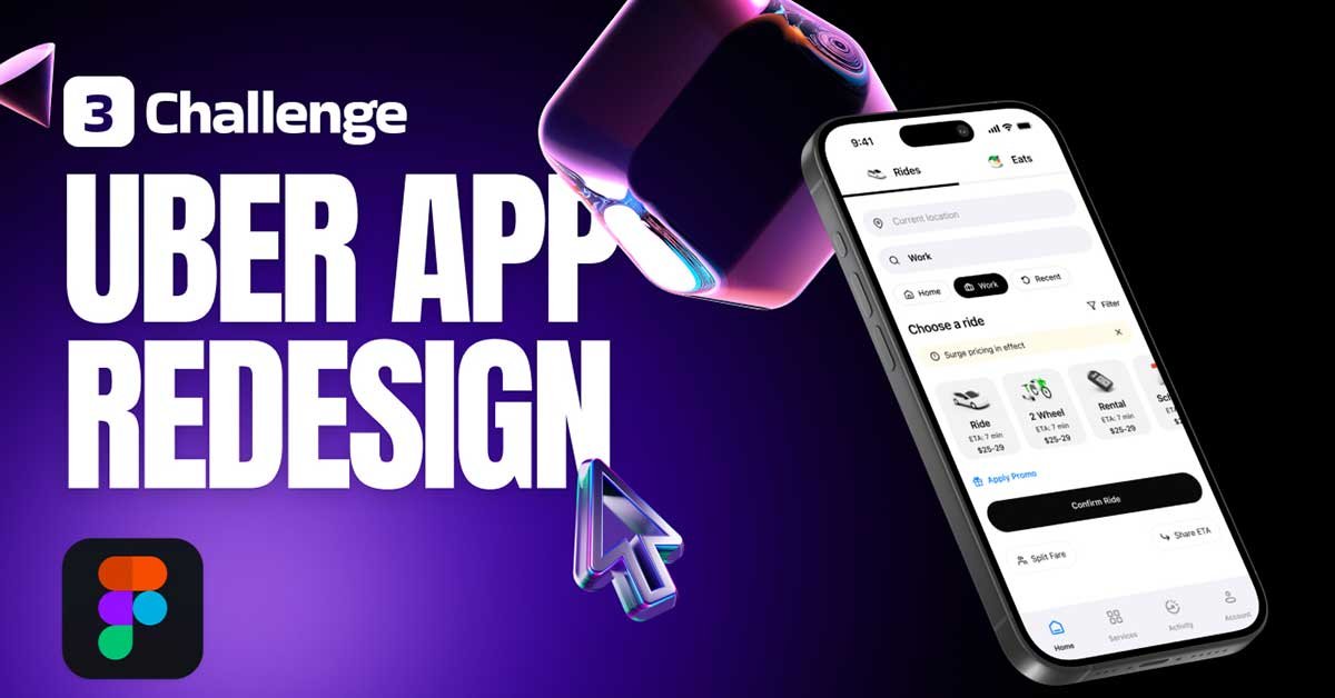
Welcome to Day 3 of the redesign series! In this tutorial, we’ll walk through the redesign of the Uber mobile app’s home screen. Whether you’re new to UI/UX design or looking to refine your skills, this guide will help you understand the step-by-step process of creating a modern, user-friendly interface in Figma.
To learn Figma, UI/UX design, web design, mobile app ui design, responsive design, no-code development, and AI-powered tools, and to download premium quality UI kits, Check out my YouTube channel (@uixDesignAcademy) for simple and easy beginner tutorials!
Setting Up the Artboard
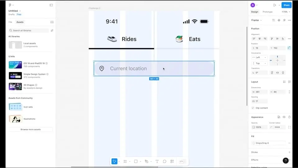
We begin by setting up a mobile artboard in Figma. Using Figma’s auto layout, components, and the 8-pixel grid system ensures consistency throughout the design. These tools are essential for maintaining alignment and creating reusable elements, making the design process more efficient and scalable.
Key Features of the Redesigned Home Screen
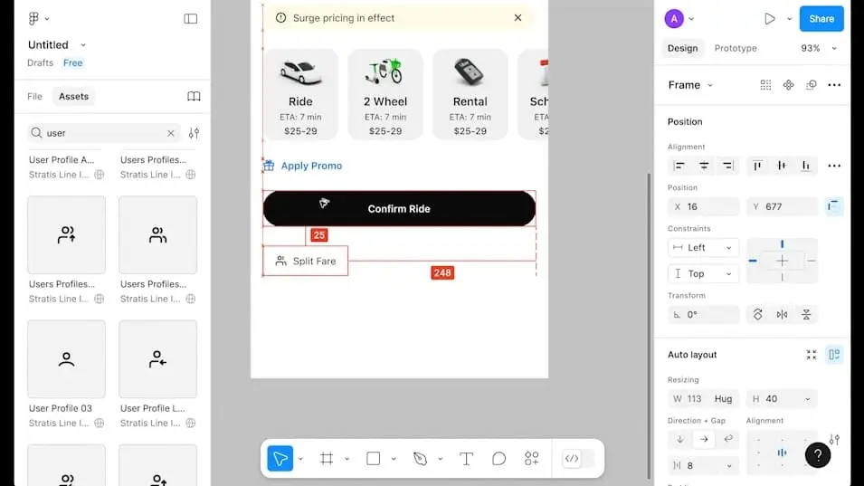
- Top Navigation Tabs: At the top of the screen, there are two clear and accessible tabs labeled “Rides” and “Eats.” These tabs allow users to seamlessly switch between Uber’s primary services.
- Location Input: Directly below the tabs, there’s an input field for entering the current location and destination. This feature is designed to simplify the booking process by making it intuitive and quick.
- Quick Selection Options: For added convenience, we’ve included three quick selection buttons: Home, Work, and Recent. These options help users save time by instantly accessing frequently used locations.
- Ride Filters and Surge Pricing Info: Below the quick selection buttons, there is a title that says “Choose a Ride” accompanied by a filter icon on the right. This filter allows users to customize their ride preferences. Additionally, an info banner provides updates on surge pricing during peak times, ensuring users stay informed.
- Ride Options: The redesigned interface includes a carousel of ride options, such as Ride, 2-Wheelers, Rentals, and Scheduled Rides. This section is visually structured to help users quickly find the service they need.
- Promotions and Discounts: If a user has any promotional codes, they’ll find a dedicated section to apply these codes. This feature is paired with a “Confirm Ride” button to streamline the booking process.
- Split Fare and ETA Sharing: Users can easily split fares for shared rides or share their ETA with others, enhancing the app’s functionality and user experience.
- Navigation Bar: At the bottom of the screen, there’s a fixed navigation bar with five key options: Home, Services, Activity, and Account. This consistent navigation structure ensures users can easily access different parts of the app.
Why This Redesign Matters
This redesign challenge is perfect for beginners eager to learn and implement auto layouts, components, and practical design principles in Figma. By following this series, you’ll gain hands-on experience working on a real-world project. For experienced designers, this tutorial offers a chance to polish your skills and experiment with modern UI trends.
Figma Tips for This Redesign
Master Auto Layout: Auto layout in Figma allows you to create dynamic and responsive designs. Practice adding spacing, padding, and alignment to make your components adaptable.
Create Reusable Components: Use Figma’s components to maintain consistency. For example, create a reusable button component for the “Confirm Ride” CTA to ensure it looks uniform across the app.
Utilize Grids and Guides: The 8-pixel grid system helps in maintaining alignment and spacing, ensuring a clean and professional design.
Prototype Interactions: Add interactive elements to your design by using Figma’s prototyping features. Simulate how users will interact with the app, from selecting ride options to applying promo codes.
Tutorial Summary
Redesigning the Uber home screen is a great way to hone your UI/UX design skills in Figma. This challenge not only improves your understanding of design tools but also helps you think critically about user experience and functionality. By the end of this series, you’ll have a professional portfolio piece that showcases your ability to tackle real-world design problems.
Whether you’re just starting out or are an experienced designer, this redesign project is a valuable exercise in improving your craft and staying updated with industry standards. Dive into Figma today and bring your redesign ideas to life!
Also if you want to watch day 1 of this redesign series or checkout 100 days daily ui design challenge,