Are you ready to level up your web design skills? Whether you’re a seasoned designer or a newbie trying to break into the field, the Figma Web Design Course 2025 is here to guide you step by step. In this first part of the course, we’re going to dive into the creation of a Food Landing Page UI Design—a critical skill in the modern world of web design. Let’s take a closer look at what this course entails and why mastering Figma for food-related projects can be a game-changer in your design career.
To learn Figma, UI/UX design, web design, mobile app ui design, responsive design, no-code development, and AI-powered tools, and to download premium quality UI kits, Check out my YouTube channel (@uixDesignAcademy) for simple and easy beginner tutorials!
Why Choose Figma for Web Design?
Figma has become the go-to design tool for many web designers around the world. It’s versatile, user-friendly, and incredibly powerful for designing everything from mobile apps to complex websites. The beauty of Figma is that it’s cloud-based, which means that whether you’re working on a food landing page, an e-commerce site, or a portfolio design, you can collaborate in real time with clients or team members.
This is why we’ve chosen Figma for our Web Design Course. In 2025, staying updated with the latest design tools is crucial for any designer, and Figma is leading the pack. You can easily access it from anywhere, and it comes with all the essential features—vector editing, prototyping, and collaboration tools—that will make your work seamless and efficient.
What Is a Food Landing Page?
Before we jump into the course material, let’s take a moment to understand what exactly a Food Landing Page is. In simple terms, a landing page is a single web page designed with a clear purpose. It’s typically the first point of contact a potential customer or visitor will have with a brand, service, or product. A food landing page, therefore, is specifically designed for the food industry.
It could be for a restaurant, a food delivery service, a catering business, or even a food blog. The goal is to create an engaging, visually appealing page that encourages visitors to take action—whether that’s making a reservation, ordering food, or signing up for a newsletter.
In this course, we’ll focus on the key elements that make a Food Web Design stand out, while ensuring it’s user-friendly and optimized for conversions.
Setting Up Your Figma Workspace
Before we get into the actual design process, let’s set up your workspace in Figma for web design. This step is crucial to ensure that your design process is smooth and efficient.
Create a New File: Open Figma, and start a new design file. Choose the “Web” frame size from the options available, and select a desktop layout (1440×1024 px) to begin your design.
Set Up Layers and Components: Create a proper structure for your design by organizing elements into layers. Figma’s ability to create reusable components is a huge time-saver. For a food landing page, components like buttons, headers, and product cards can be reused across the page.
Import Assets: If you’re using stock images, food icons, or logos, make sure to import them into your Figma file. A food landing page is all about visuals, so having high-quality images and clear icons will make your design look polished and professional.
Step-by-Step Process: Designing Your Food Landing Page UI
Now that we have our workspace set up, let’s move on to the actual design. Here’s a step-by-step guide to creating a Food Web Design in Figma.
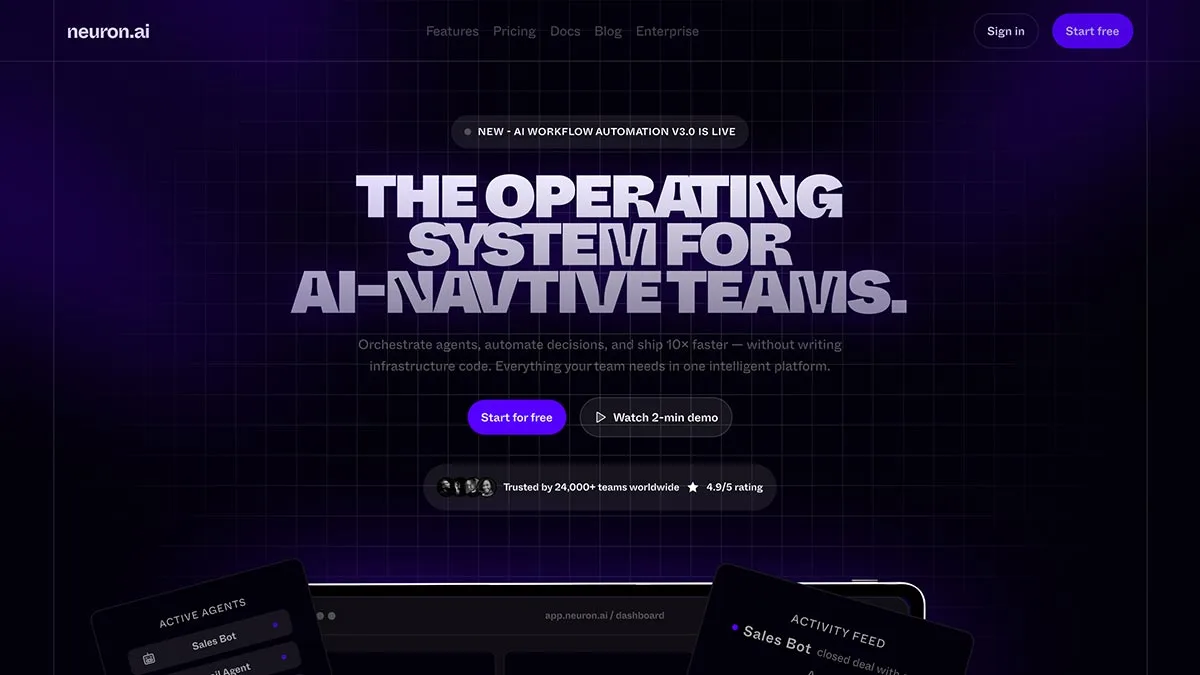
1. Create the Hero Section
The hero section is the first thing users will see when they land on your page. It needs to be visually striking and convey the message immediately.
Choose a Great Image: Select a high-quality image that represents the food or service you’re offering. If it’s a restaurant, maybe a well-plated dish or a beautiful restaurant interior. For a food delivery service, an image of freshly prepared meals or happy customers enjoying food can work.
Add Headline and Subheadline: Your headline should clearly explain what your business is about. For example, “Order Fresh, Delicious Meals Right to Your Doorstep.” Below that, a subheadline can provide more context, like “Fast, Reliable Delivery Every Time.”
Call to Action (CTA): The CTA should stand out, whether it’s a “Order Now” button, “View Menu,” or “Book a Table.” Make sure the button is large enough to catch attention but not overwhelming. You can use Figma’s prototyping features to make sure the button works seamlessly when clicked.
2. Design the Menu or Product Section
Once users scroll down, they want to see what’s on offer. This section should display your food menu or products in an attractive, easy-to-navigate way.
Product Cards: Use Figma to create reusable components for each food item. Each card can have a picture of the dish, the name, a short description, and the price. You can use Figma’s auto-layout feature to ensure everything is spaced evenly.
Categories: If you have a large menu, consider dividing the items into categories, such as “Starters,” “Main Courses,” or “Desserts.” You can use Figma’s prototyping features to add smooth transitions between categories.
3. Add Testimonials or Reviews Section
Social proof is crucial in food-related businesses. People love seeing what others say before trying a new restaurant or service.
Create Review Cards: Design simple review cards in Figma using a combination of text and stars for ratings. You can also add profile pictures of happy customers or clients.
Slider for Testimonials: If you want to showcase several reviews, consider making a testimonial slider. Figma allows you to prototype this functionality easily, so your design looks interactive even in the wireframe stage.
4. Footer Design
A good footer contains important information like contact details, social media links, privacy policies, and more. It’s the final section visitors will see, so make sure it’s clean and organized.
Logo and Branding: Include your logo at the top of the footer for brand consistency.
Navigation Links: Add links to other important sections like “About Us,” “Menu,” or “Contact.”
Tips for Designing a High-Converting Food Landing Page
Keep it Simple: Don’t overcrowd your page with too much text or too many images. Use Figma to align elements properly, and make sure the design is clean and uncluttered.
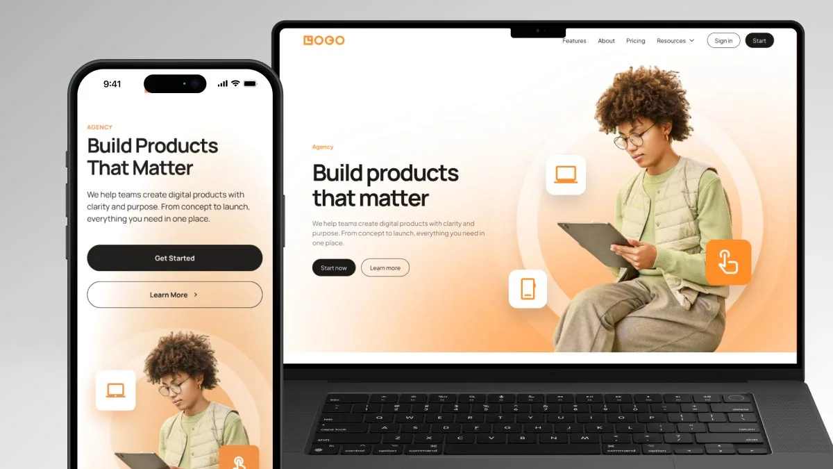
Responsive Design: In 2025, most users will be browsing on mobile devices. Make sure your design is responsive, meaning it should adjust and look great on all screen sizes. Figma’s ability to resize frames makes this a breeze.
Optimize for Speed: Fast loading times are crucial. High-resolution images may look great, but they can slow down your site. Optimize images before adding them to Figma.
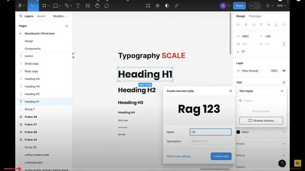
Use Color and Typography Wisely: Choose colors that align with the brand’s identity. For a food landing page, warm tones like reds, oranges, and yellows can evoke hunger and excitement. Also, select easy-to-read fonts that match the vibe of the food brand.
Stay tuned for responsive web design part 2 tutorial with complete step by step process. In the meantime you can watch another travel web design landing page in figma here