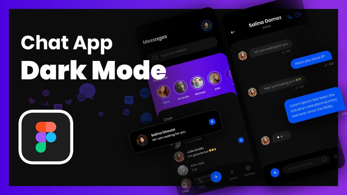
In today’s digital world, messaging apps have become an essential part of communication. Designing a messaging app UI design requires a user-centric approach to ensure a seamless and engaging experience. This article will explore the key design aspects of a chat app UI design, focusing on two pages—Inbox (Home) Page and Chat (Conversation) Page—for both dark mode in Figma and light mode in Adobe XD.
To learn Figma, UI/UX design, web design, mobile app ui design, responsive design, no-code development, and AI-powered tools, and to download premium quality UI kits, Check out my YouTube channel (@uixDesignAcademy) for simple and easy beginner tutorials!
Understanding the Importance of Messaging App UI Design
A well-crafted messaging app UI design enhances user experience by making communication efficient and visually appealing. Whether a user is chatting with friends, searching for a specific message, or sharing multimedia, an intuitive design ensures smooth navigation and usability.
Designing the Inbox/Home Page
The Inbox page in messaging app UI design serves as the main hub where users can access their conversations, search for messages, and view their favorite contacts. Here are the essential components of this page:
1. Page Title & Profile Picture
At the top of the Inbox page, the user sees the page title (e.g., “Chats”) along with their profile picture, which provides a quick way to access their account settings.
2. Search Bar
Below the title, a search bar allows users to search for specific messages or contacts efficiently. The search function improves usability and helps users find conversations quickly.
3. Horizontal List of Favorite Friends
A horizontal scrollable list of favorite friends is displayed below the search bar. Each friend is represented with a circular profile picture and their name beneath it. This feature provides quick access to frequently contacted people.
4. Messages List
Below the favorites section, users see their messages list, which includes both read and unread messages. Unread messages are highlighted to draw attention, while read messages appear in a neutral format. This organization ensures users can prioritize conversations effectively.
5. Bottom Navigation Bar
The bottom bar includes five essential options:
- Chat – Opens the inbox page
- Call – Shows call history and contacts for voice/video calls
- Create New Message – Allows users to start a new conversation
- Status – Shows status updates of contacts
- Settings – Provides access to user preferences and app settings
This layout ensures a well-structured chat app UI design that simplifies navigation and enhances usability.
Designing the Chat/Conversation Page
The Chat page in messaging app UI design is where users engage in direct communication. It needs to be visually appealing and functionally efficient. Here are the key components:
1. User Information at the Top
At the top of the chat page, users see:
- Name of the contact
- Online/offline status (to indicate availability)
- Voice and video call buttons (placed on the right side for quick access)
2. Conversation Section
The main chat area displays messages exchanged between users. The messages are typically shown in:
- Speech bubbles (one color for sent messages, another for received messages)
- Timestamps for each message
- Read/unread indicators
This layout ensures that users can easily distinguish between their messages and their contact’s responses.
3. Message Input & Attachments
At the bottom of the chat page, the input section includes:
- Plus Icon – Allows users to attach media, documents, or other files
- Text Input Field – Where users type their messages
- Emoji & Microphone Icon – Provides options to send emojis and voice messages
- Send Button – Enables users to send the message
This arrangement ensures a user-friendly typing experience with easy access to essential features.
Light Mode in Adobe XD & Dark Mode in Figma
Designing for both light and dark modes for messaging app UI design improves usability and accommodates user preferences.
Light Mode (Adobe XD)
- Bright background with dark text for readability
- Subtle color contrasts to distinguish elements
- Soft shadows and gradients for a modern look
Dark Mode (Figma)
- Dark background with light text to reduce eye strain
- High contrast to make UI elements stand out
- Minimal use of bright colors to maintain a sleek appearance
By designing both modes, users can switch according to their preference, enhancing accessibility and user satisfaction.
Interested to learn from beginners tutorials of figma 100 days – daily ui design challenge. watch here
Conclusion
A well-designed messaging app UI design ensures an efficient and engaging communication experience. By carefully structuring the Inbox page and Chat page, incorporating light and dark mode designs, and focusing on usability and accessibility, designers can create a visually appealing and functional chat app UI design. Whether using Figma for dark mode or Adobe XD for light mode, a user-centric approach will lead to a successful messaging app UI.